Device-Agnostic Design Philosophy
Learning Objectives
- You know the term device-agnostic design and know of its relation to the W3C design principles.
- You know of the challenges and solutions related to device-agnostic design.
- You know of progressive enhancement and know of the relation between device-agnostic design and progressive enhancement.
Device-Agnostic Design
The term device-agnostic design refers to a philosophy of design that seeks to create services that can be accessed and used by anyone, regardless of the device or platform they are using. The vision is to ensure that all developed services work on any device, at any time, and anywhere.
When we consider device-agnostic design, we also note that it is very well-aligned with the World Wide Web Consortium’s (W3C) design principles, which includes the following:
Web for All: “The social value of the web is that it enables human communication, commerce, and opportunities to share knowledge. One of W3C’s primary goals is to make these benefits available to all people, strive for diversity and inclusion of participants from different geographical locations, cultures, languages, disabilities, gender identities, and more.”
Web on Everything: “The number of different kinds of devices that can access the web has grown immensely. Mobile phones, smart phones, interactive television systems, voice response systems, kiosks and even certain domestic appliances can all access the web.”
The ecosystem of possible devices and platforms does not, in practice, have bounds. The most common devices include smartphones, tablets, laptops, and desktop computers. However, there are also devices like smart watches, virtual reality headsets and smart home appliances, not to mention for example cars and their dashboards. There are also a wide array of platforms that one could target, which include operating systems like Windows, macOS, Linux, Android, and iOS, as well as the wide variety of web browsers that are contemporary application platforms.
When designing device-agnosticly, one designs and creates interfaces that adapt to different screen sizes and resolutions, as well as to different input methods, such as touchscreens and keyboards.
In practice, device-agnostic design involves using flexible layouts, scalable images, and responsive design techniques to ensure that content is presented in a way that provides good user experience, regardless of the device being used to view it.
Challenges
Device-agnostic design is hindered by a plethora of challenges, which stem from the vast range of available digital devices. The devices range from personal computers to laptops and from mobile phones to smart watches. Even smartpens can be a part of a device-agnostic system (see e.g. Livescribe), similar to a wide variety of control applications such as applications used to access and display car information on mobile phones and tablets (see e.g. Lightware Technology).
In a device-agnostic design project, the following challenges are to be expected:
-
Handling different types of inputs — there exists a range of physical and virtual keyboards, touch input options, gesture inputs, and audio and visual recognition capabilities for providing input.
-
Handling different types of outputs — there exists a range of physical and virtual displays, speakers, and haptic feedback devices for providing output.
-
Handling different network capacities — designing for networks from old slow serial protocols to terabit networks, and from short range NFT and Bluetooth conectivity to globally (almost) ubiquitous 4G cellular networks with speeds up to 450MB/s.
-
Handling different screen sizes — the differences in screen sizes are vast, ranging from a tangible physical desice (such as the mentioned smartpen) that may have only a single power led, to modern mobile phones and computer dislays that reach over 500 PPI (pixels per inch) and high-end displays that are about to move from 4K resolutions (4096x2160) to 8K resolutions (8192x4320).
-
Handling outdated or even hostile browsers and devices — users do not always use the latest versions of web browsers and the update process for mobile devices is notoriously slow, even for the latest flagship models. Even network infrastructure such as routers and wireless base stations are recommended to be upgraded at least every three to five years, which seldomly happens.
In addition, the capabilities of devices also differ, as some devices may have limited processing power, memory, and graphics capabilities, while others may have more advanced capabilities, not to mention the differences in battery life. Finally, users may also access content in different contexts, such as on-the-go or in a quiet environment. This can make it difficult to create a design that works well in all contexts; in practice, designs can also include limiting the available features on certain device types.
These challenges can make device-agnostic design a complex and time-consuming process, requiring careful consideration and planning. In practice, device-agnostic design projects typically limit the scope to match only specific requirements that can be inferred e.g. from the context of use.
Solutions
Most of the solutions for the above challenges are related to considering the requirements of the end product. Leading questions include whether it is necessary to support all the available devices, whether all the functionality offered by the devices are needed, and to what extent the quality and complexity of the functionality could be lowered without a significant negative impact on the user experience.
Broadly speaking, the solutions could be divided into simplification and prioritization of design and functionality.
When considering simplication of design, a meaningful starting point is to remove features that are not worth the effort and consequently to manage the size and loading time of the application. Here, approaches such as flat design and scalable design may help. With flat design, one would avoid graphics that require specialised hardware (e.g. 3D graphics) and utilize basic color schemes without gradients and shadows. With scalable design, on the other hand, one would create designs that adapt flexibly to various pixel densities, and if needed, use efficient graphics formats such as scalable vector graphics (SVG) instead of raster formats (PNG, GIF, JPG).
Similarly, with prioritization, one would consider the most important features and functionalities and focus on those. This can be done by considering the most common devices and the most common use cases, and by considering the most common user groups and their needs. For example, if the application is used by a large number of elderly people, one would consider the use of large fonts and simple color schemes, avoiding complex animations and transitions. For prioritization, there are a range of approaches, such as user first, content first, mobile first, and fat finger first.
User First
- Think of the users, usability and user experience
- Will the system be usable, accessible, inclusive, effective, and enjoyable to the target users?
Content First
- Think of the content and the context of use, accounting for the devices and users
- Will the content be readable even on the smallest device that the target group will have at their disposal?
Mobile First
- Almost 60% of web site traffic comes already from mobile devices
- Consider starting the design by targeting mobile devices and then expanding to other devices
- Progressive Advancement vs. Graceful Degradation
- Will you assume simplicity and build towards more complexity?
- Or, will you embrace high complexity and seek solutions to make it work with limited resources?
Fat Finger First
- Think of the interaction with the device, again accounting for the devices and users
- People are poking and swiping at everything nowadays — do not design for touch interaction retrospectively!
- Will the system be usable with a fat finger, a fat thumb, or a fat toe?
Device-Agnostic Design and Progressive Enhancement
In How a device-agnostic approach could improve your design, Miller suggests viewing device-agnostic approach as a three step progressive enhancement process.
Progressive enhancement means that you start with a basic version of the content that can be accessed on all devices, and then add advanced features for devices with more capabilities. This approach can ensure that the content is accessible and usable on all devices, while still providing advanced features for devices with more capabilities.
In effect, first, one should design for the lowest common denominator, finding the absolute necessary core features that need to run on all devices. Second, one should figure out the most resource efficient way of implementing the service, also using available native components and re-using code whenever possible. Third, one should maximize the user experience by identifying key user flows, and work around limitations making use of the innate benefits of each device (e.g., a mobile phone is always with the user, while a desktop has more pixels). This flow is summarized in Figure 1.
It is important to note that the goal of device-agnostic design is not to create a single design that works on all devices. Instead, the goal is to create a design that is flexible and adaptable, so that it can be optimized for different devices and platforms, while still providing a consistent user experience. For consistency, one could follow a design system (discussed later in the course), while still designing content-first, i.e. identifying the key content that needs to be presented and explore how it can be structured in a way that is easy to read and navigate on any device. This includes considering how the content will be presented on different screen sizes and input methods.
Presenting the content on different screen sizes and allowing different input methods could be realized through using a flexible layout that can adapt to different screen sizes and resolutions, while still remembering to also use a touch-friendly design to accommodate for the vast body of mobile users. One potential starting point would be touch-friendly design that uses elements such as larger buttons and simplified forms to make it easier to interact with the content with mobile devices and tablets.
Finally, as a part of the design process, it would also be important to test the design across devices. This could be done by using a variety of devices, including smartphones, tablets, laptops, and desktops, to ensure that the design is accessible and usable on all devices.
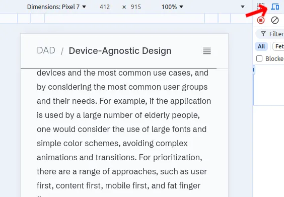
Here, emulators and device-specific functionalities in contemporary web browsers are highly useful. As an example, Google Chrome has a “Toggle Device Toolbar” functionality in the developer tools that allows one to simulate different devices and screen sizes, while also providing a range of network conditions to test the design in different network environments (shown in Figure 2).