Overview
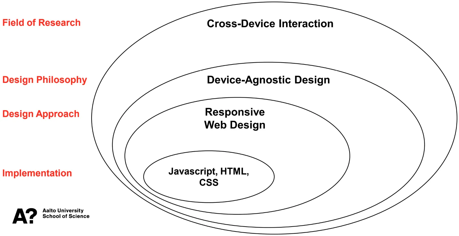
When introducing Device-Agnostic Design in the course overview, we placed it as a part of the Cross-Device Interaction research field (that belongs to the Human-Computer Interaction research field), and showed Responsive Web Design as a possible design approach. The big picture is illustrated in Fig. 1.
In the third part of the course, we look into Device-Agnostic Design as a philosophy, and visit Responsive Web Design as a design approach. We then look into building responsive functionality into Flutter, visiting both responsive widgets and widgets that allow building flexible layouts. Finally, as at this point you are becoming more and more familiar with Flutter, you are tasked to also go through a third-party tutorial on building a responsive application.
The third part of the course is divided into the following chapters:
- Device-Agnostic Design Philosophy introduces Device-Agnostic Design as a philosophy, discussing some of the challenges and solutions related to it.
- Responsive Web Design outlines Responsive Web Design and demonstrates how functionality from Cascading Style Sheets (CSS) is used to to create responsive web applications.
- Responsive Widgets with Flutter presents two widgets that allow building responsive functionality into Flutter applications:
MediaQueryandLayoutBuilder. - Flutter Space, Boxes, and Cards continues on the theme of layouts in Flutter, discussing layout widgets and grouping contents.
- Flutter Flexible Layouts presents two widgets that allow flexibility in content placement:
ListViewandGridView, and discusses the possibility of creating a custom scaffold. - Third-party Tutorial tasks you to work on a third-party tutorial focusing on building a responsive application.
- Finally, at the end of the third part, in Recap and Feedback, we’ll summarize the contents of the part, and again ask you to reflect and provide feedback on the contents and your learning in this part.