Tailwind CSS and Skeleton
Learning Objectives
- You know of the existence of CSS frameworks and component libraries.
- You can set up Tailwind CSS and Skeleton in a Svelte project.
In contemporary web development, it is becoming increasingly rare to create styles from scratch — most developers rely on CSS libraries and frameworks.
A CSS framework is a collection of CSS files that contain predefined CSS rules and styling for common elements. There are many CSS frameworks available. One of the more popular ones is Tailwind CSS, which provides utility classes for styling elements. CSS frameworks can be used jointly with component libraries and UI toolkits, which come with collections of components (or styles for defining components) that are used when building the website. One such component library is Skeleton, which builds on top of Tailwind CSS.
The following two sections describe setting up Tailwind CSS and Skeleton. Addng Tailwind CSS has been adapted from Tailwind CSS SvelteKit guide, while the part on adding Skeleton has been adapted from Skeleton SvelteKit guide.
Adding Tailwind CSS
To install Tailwind CSS to the walking skeleton, go to the folder client and run the following command.
deno install --dev npm:tailwindcss npm:@tailwindcss/viteThis installs Tailwind CSS and a Vite preprocessor for Tailwind to the project. Next, modify the vite.config.js file in the client folder to match the following.
import { sveltekit } from "@sveltejs/kit/vite";
import { defineConfig } from "vite";
import tailwindcss from "@tailwindcss/vite";

export default defineConfig({
	plugins: [
		tailwindcss(),
		sveltekit(),
	],
});
This change adds the Tailwind CSS plugin to the Vite configuration.
Almost ready! Now, create a file called app.css to the client/src folder. Place the following content to the file.
@import "tailwindcss";Then, create (or modify) the +layout.svelte file in the client/src/routes folder to import the app.css file. After the change, the +layout.svelte should look as follows.
<script>
  import "../app.css";
  let { children } = $props();
</script>

{@render children()}
Finally, create (or modify) the file +page.svelte in the client/src/routes folder to match the following.
<script>
  let count = $state(0);
</script>

<h1>Hello world!</h1>
<p>Count: {count}</p>
<button onclick={() => count++}>increment</button>
Now, when you restart the application with docker compose up --build, or alternatively run the command deno run dev in the client folder, the application should look somewhat similar to the one shown in Figure 1.
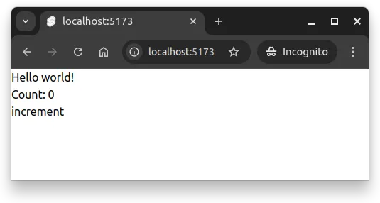
In Figure 1, even through we have a heading element, a paragraph, and a button, they all look like normal text. This is because Tailwind CSS removes the default styling of the elements.
Tailwind forms plugin
Tailwind has a forms plugin, which we want to have in the project as well. To add it, run the following command in the client folder.
deno install --dev npm:@tailwindcss/formsThen, modify the client/src/app.css to match the following (i.e., importing the plugin).
@import "tailwindcss";
@plugin "@tailwindcss/forms";
Now, modify the +page.svelte file to match the following.
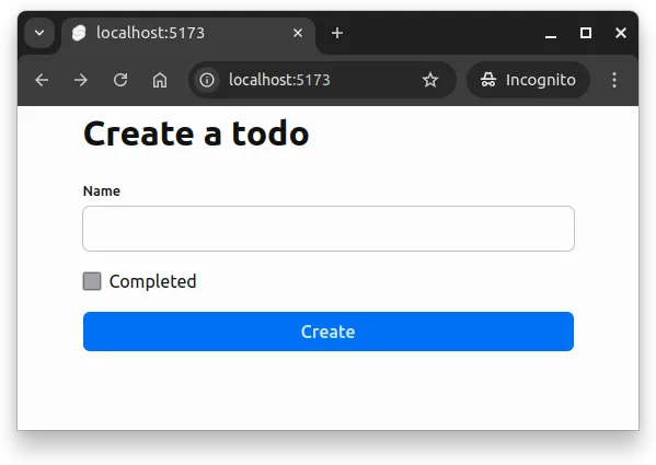
<form class="max-w-sm mx-auto mt-6">
  <h2 class="text-2xl mb-4">Create a todo</h2>
  <div class="mb-4">
    <label for="name">Name</label>
    <input
      type="text"
      id="name"
      name="name"
      class="w-full"
      placeholder="Enter name"
    />
  </div>

  <div class="mb-4 items-center">
    <input type="checkbox" id="completed" name="completed" />
    <label for="completed" class="ml-2">Completed</label>
  </div>

  <input
    type="submit"
    class="w-full bg-blue-600 text-white p-2 rounded-lg hover:bg-blue-700"
    value="Create"
  />
</form>
Once the changes are in place, save the files, and restart the application. The page should look similar to the one shown in Figure 2.
The above example demonstrates the use of utility classes from Tailwind CSS. We’ll look into them in more detail in a bit, but let’s first add Skeleton to the project.
Adding Skeleton
To add Skeleton to the project, go to the client folder again, and run the following command.
deno install --dev npm:@skeletonlabs/skeleton@next npm:@skeletonlabs/skeleton-svelte@nextThe command adds Skeleton 3 (release candidate or newer) dependencies to the project. Next, modify the client/src/app.css file to match the following.
@import "tailwindcss";
@plugin "@tailwindcss/forms";

@import "@skeletonlabs/skeleton";
@import "@skeletonlabs/skeleton/optional/presets";
@import "@skeletonlabs/skeleton/themes/cerberus";

@source "../node_modules/@skeletonlabs/skeleton-svelte/dist";
This brings in Skeleton and its themes to the project. Above, we have imported a theme called “cerberus” from Skeleton.
Themes are listed at https://next.skeleton.dev/docs/design/themes.
Then, modify the app.html file in the client/src folder to match the following.
<!doctype html>
<html lang="en">
	<head>
		<meta charset="utf-8" />
		<link rel="icon" href="%sveltekit.assets%/favicon.png" />
		<meta name="viewport" content="width=device-width, initial-scale=1" />
		%sveltekit.head%
	</head>
	<body data-sveltekit-preload-data="hover" data-theme="cerberus">
		<div style="display: contents">%sveltekit.body%</div>
	</body>
</html>
The above change adds the data-theme attribute with the value “cerberus” to the body element, setting the theme of the application to the “cerberus” theme from Skeleton.
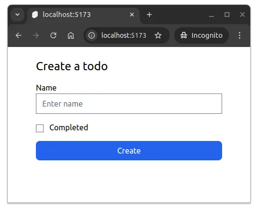
Now, modify the client/src/routes/+page.svelte file to match the following.
<form class="mx-auto w-full max-w-md space-y-4">
  <h2 class="h2">Create a todo</h2>

  <label for="name" class="label">
    <span class="label-text">Name</span>
    <input class="input" type="text" id="name" name="name" />
  </label>

  <label class="flex items-center space-x-2">
    <input class="checkbox" type="checkbox" id="completed" name="completed" />
    <p>Completed</p>
  </label>

  <button type="submit" class="w-full btn preset-filled-primary-500">
    Create
  </button>
</form>
After restarting the application, the form should look similar to the one shown in Figure 3.