Styling an Application
Learning Objectives
- You know how to style application parts using Tailwind CSS and Skeleton.
- You know of transitions, animations, and toasts.
Here, we briefly look into styling a todo application using Tailwind CSS and Skeleton. We start with styling a form, which is followed by styling item collections (cards). Then, we briefly look into transitions, animations, and toasts.
Forms
Skeleton relies on the Tailwind Forms plugin when styling forms. When styling forms, we again use a set of utility classes that provide styles to our application.
Skeleton’s guidelines on styling forms are available at https://next.skeleton.dev/docs/tailwind/forms.
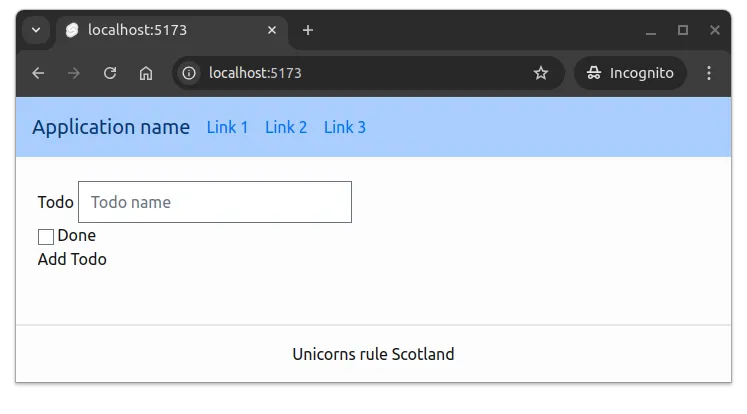
Let’s look at styling the following form that we have previously used for adding todos. The “onsubmit” attribute that would call the “addTodo” function, and the functionality for processing the form, is omitted for brevity. Place the following content to the +page.svelte file in the src/routes folder.
<form>
  <label for="name">Todo</label>
  <input id="name" name="name" type="text" placeholder="Todo name" />
  <div>
    <input id="done" name="done" type="checkbox" />
    <label for="done">Done</label>
  </div>
  <input type="submit" value="Add Todo" />
</form>
With the layout that we created in the previous chapter, the form looks something like the one in Figure 1.
When styling input elements, we use the class “input” for the input element, and the class “label” for the label element. In addition, for the text of the label, we use the class “label-text”. The input element is also placed within the label element.
The styling of the input element would be as follows.
<label class="label" for="name">
  <span class="label-text">Todo</span>
  <input class="input" id="name" name="name" type="text" placeholder="Todo name" />
</label>
For checkboxes, we use the “checkbox” class for the input element and the “flex” class for the label element to display the checkbox and the label side by side. In addition, “items-center” is used to align the items vertically, and “space-x-2” is used to avoid the checkbox and the label being too close to each other.
The styling of the checkbox element would be as follows.
<label class="flex items-center space-x-2" for="done">
  <input id="done" name="done" type="checkbox" />
  <p>Done</p>
</label>
For the button, we would replace the input element with a button, using type “submit” for the button. For styling, we would use a button variant from Skeleton. The button is styled using the “btn” class, the “preset-filled-primary-500” class is used to set the button color to the primary color of the theme, and “w-full” is used to make the button fill the width of the parent element.
The styling of the button element would be as follows.
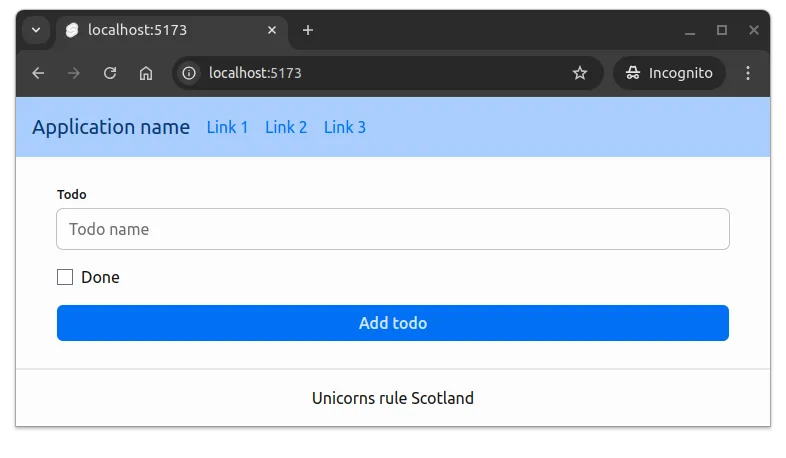
<button class="w-full btn preset-filled-primary-500" type="submit">Add todo</button>With this, the form would look almost acceptable, but the form elements are horizontally very close to each other. To add some space between the elements, we add the space-y-4 class to the form element to add space between the elements vertically.
Together, the styling of the form would be as follows.
<form class="space-y-4">
  <label class="label" for="name">
    <span class="label-text">Todo</span>
    <input
      class="input"
      id="name"
      name="name"
      type="text"
      placeholder="Todo name"
    />
  </label>
  <label class="flex items-center space-x-2" for="done">
    <input id="done" name="done" type="checkbox" />
    <p>Done</p>
  </label>
  <button class="w-full btn preset-filled-primary-500" type="submit">Add todo</button>
</form>
Now, the form would look something like the one in Figure 2.
The above could be placed in a separate component, such as TodoForm.svelte, with the logic used to concretely add todos.
Cards
Cards are typically used to display a collection of items in a structured manner. For example, in our case, we migh use cards to display a list of todos. The card could contain the name of the todo and a button to mark the todo as done.
Skeleton has a class “card” for getting started with styling cards. Modify the +page.svelte file in the src/routes folder to match the following.
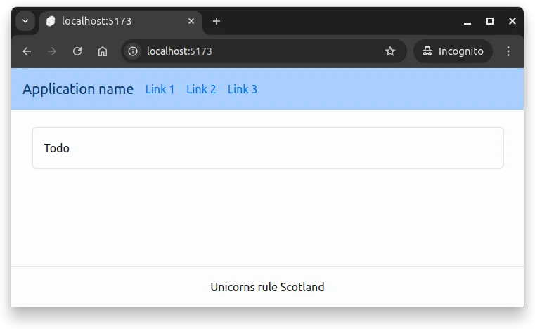
<div class="card border-[2px] p-4 border-gray-300">
	<span>Todo</span>
</div>
The above code creates a card with the text “Todo” that has a border and padding. The card would look similar to the one in Figure 3.
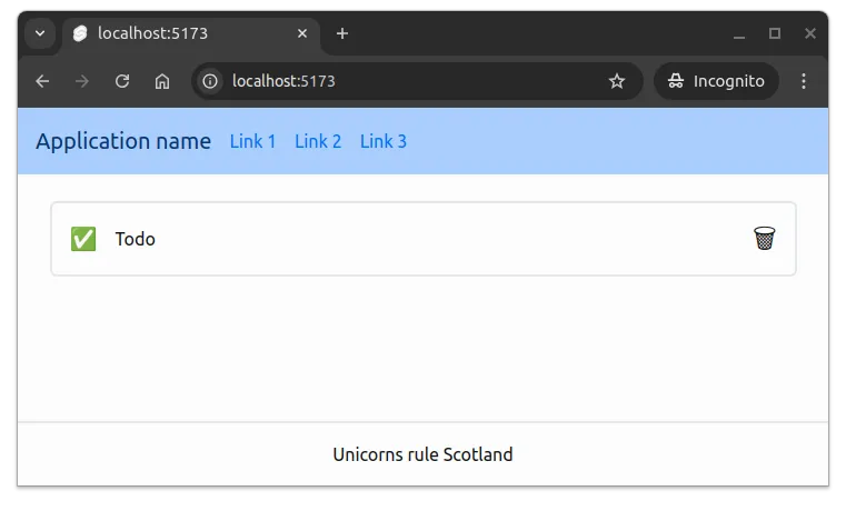
To create a card with an icon indicating whether it is correct or not, the text, and an icon to delete the todo, we can use the checkmark UTF-8 character (✅) or the incorrect UTF-8 character (❌) for the icon. The delete icon could be the wastebasket UTF-8 character (🗑).
To show the elements side-by-side, we can use the “flex” class, which is typically used with “items-center” to align items vertically. In our case, as we want the wastebasket to the side, we can also add the “grow” property to the text to make it grow to fill the available space. Finally, we also want to use “space-x-2” to add some space between the items horizontally.
flex utility class. The items-center class is used to align the items vertically, and the space-x-4 class is used to add space between the items horizontally.
Modify the +page.svelte file in the src/routes folder to match the following.
<div class="flex items-center space-x-4 card border-[2px] p-4 border-gray-300">
	<span class="text-xl">✅</span>
	<span class="grow">Todo</span>
	<span class="text-2xl">🗑</span>
</div>
With the above, the card would look something like the one in Figure 4.
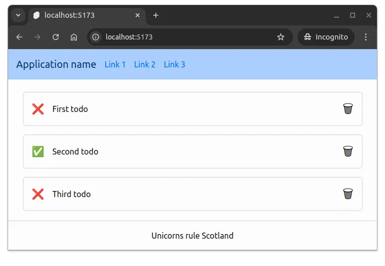
In practice, todos like the above would be managed in a list, and the cards would be generated dynamically based on the todos. Create an element called Todo.svelte in the src/components folder, and place the following content to the file.
<script>
  let { todo, removeTodo } = $props();
</script>

<div class="flex items-center space-x-4 card border-[2px] p-4 border-gray-300">
  <span class="text-xl">{todo.done ? "✅" : "❌"}</span>
  <span class="grow">{todo.name}</span>
  <button class="text-2xl" onclick={removeTodo}>🗑</button>
</div>
Above, the Todo.svelte component takes a todo and a removeTodo function as props, which it uses to display the todo. We have also changed the type of the element for removing the todo to a button, and added an onclick event to call the removeTodo function.
Now, modify the +page.svelte file in the src/routes folder to import the Todo.svelte component and use it to create a few todos. The following shows one possible way of doing this.
<script>
  import Todo from "$lib/components/Todo.svelte";

  let todos = $state([
    { name: "First todo", done: false },
    { name: "Second todo", done: true },
    { name: "Third todo", done: false },
  ]);

  const remove = (todo) => {
    todos = todos.filter((t) => t !== todo);
  };
</script>

<ul class="space-y-4">
  {#each todos as todo}
    <li>
      <Todo {todo} removeTodo={() => remove(todo)} />
    </li>
  {/each}
</ul>
With the above, the page would look something like the one in Figure 5.
The above example also already allows removing todos from the list.
Transitions
Svelte comes with a bunch of transitions that can be used to animate elements. For example, the fade transition can be used to fade elements in and out.
To use transitions, we need to import the transition, and then apply it in the element that we want to animate. As an example, if we would wish that the todos fade out when removed, we could use the fade transition. This would be implemented as follows.
<script>
	import Todo from "$lib/components/Todo.svelte";
	import { fade } from "svelte/transition";

  let todos = $state([
    { name: "First todo", done: false },
    { name: "Second todo", done: true },
    { name: "Third todo", done: false },
  ]);

  const remove = (todo) => {
    todos = todos.filter((t) => t !== todo);
  };
</script>

<ul class="space-y-4">
  {#each todos as todo (todo)}
    <li transition:fade>
      <Todo {todo} removeTodo={() => remove(todo)} />
    </li>
  {/each}
</ul>
With the above, the todos fade out when removed from the list.
Note that above, the {#each todos as todo (todo)} has a parenthesis at the end with the todo. This is used by Svelte as a key to identify the elements in the list. The key is used to determine which elements have changed, and to apply the transition only to the elements that have changed.
The key could also be, for example, an id of the todo, if the todo had an id.
Toast
As mentioned earlier, Skeleton comes also with some ready-made components. One of them is Toast, which is used to display small notifications at the edge of the screen.
The documentation for the Toast component is available at https://next.skeleton.dev/docs/integrations/toasts/svelte.
To use ready-made toast functionality, we need to first import a ToastProvider from @skeletonlabs/skeleton-svelte and add it to our layout. The ToastProvider should wrap the content that we want to display the toasts in — let’s wrap the whole content in the layout with the ToastProvider.
<script>
  import "../app.css";

  import { ToastProvider } from "@skeletonlabs/skeleton-svelte";

  import Header from "$lib/components/layout/Header.svelte";
  import Footer from "$lib/components/layout/Footer.svelte";

  let { children } = $props();
</script>

<ToastProvider>
  <div class="flex flex-col h-full">
    <Header />

    <main class="container mx-auto max-w-2xl grow">
      {@render children()}
    </main>

    <Footer />
  </div>
</ToastProvider>
The toast provider exposes functionality for displaying toasts to Svelte’s Context functionality that allows passing data through the application. To display a toast, we need to first get access to to toast functionality in the context, and then use the toast functionality to create toasts.
The following example shows how to, with a high likelihood, display an error toast when the user tries to remove a todo.
<script>
  import Todo from "$lib/components/Todo.svelte";
  import { fade } from "svelte/transition";

  import { getContext } from "svelte";
  const toast = getContext("toast");

  let todos = $state([
    { name: "First todo", done: false },
    { name: "Second todo", done: true },
    { name: "Third todo", done: false },
  ]);

  const remove = (todo) => {
    if (Math.random() < 0.9) {
      toast.create({
        title: "Error",
        description: "Failed to remove todo",
        type: "error",
      });
			return;
    }

    todos = todos.filter((t) => t !== todo);
  };
</script>

<ul class="space-y-4">
  {#each todos as todo (todo)}
    <li transition:fade>
      <Todo {todo} removeTodo={() => remove(todo)} />
    </li>
  {/each}
</ul>
The new functionality first imports the getContext function and then uses it to access the toast-specific context. The toast-specific context allows displaying toast messages.
Once the context is retrieved, it can be used to create a toast notification with the create method. The method takes three attributes, title, description, and type, where the type can be “error”, “info”, or “success”.
Continuing with styling
When working on styling an application, it is often a good idea to start with the most important elements, and then continue with the less important elements. In the case of the todo application, the most important elements could be seen as the form for adding todos and the cards for displaying the todos.
In the process, it is also meaningful to explore the documentations of the frameworks and libraries used, to find suitable components for the purpose. To see some possibilities, e.g. Tailwind CSS has a showcase.