Common Layout Structure
Learning Objectives
- You know of the common parts in a web application layout.
- You know how to define a common layout using Tailwind CSS and Skeleton.
Tailwind CSS advocates a utility-first approach to styling, where the style framework provides a set of utility classes that can be used to style the application. The utility classes are often small, such as bg-red-500 for setting the background color to red, or text-2xl for setting the text size to extra large; styling a component often involves using a wide range of utility classes.
Many of the utility classes correspond directly to CSS styles — as an example, the class flex corresponds to setting the value of display property to flex, while the class flex-row corresponds to setting the value of flex-direction property to row.
Skeleton somewhat simplifies the usage of Tailwind CSS by providing a streamlined set of utility classes, and a set of common components for the user interface. In practice, when using Skeleton, knowledge of Tailwind CSS is also needed.
Forming an in-depth understanding of Tailwind CSS, Skeleton, and styling would take considerably more time than we available in this 5 ECTS course. Here, we’ll work on a simple example to get you started.
Common Layout Structure
When building a web application, it is common to have a common layout structure that is shared across the pages. The common layout structure often contains a navigation bar, a footer, and a main content area. The navigation bar is used for navigating between the pages, the footer is used for providing information about the application, and the main content area is used for displaying the content of the specific page.
When creating the layout structure, we want to use semantic HTML elements to describe the structure of the page. The navigation bar is often placed inside a header element, the footer is placed inside a footer element, and the main content area is placed inside a main element.
Let’s start with a basic layout that looks as follows, and start adding content to it. The following layout simply imports Tailwind CSS and renders the children (i.e., the pages).
<script>
  import "../app.css";
  let { children } = $props();
</script>

{@render children()}
In addition, let’s use the following as the content for +page.svelte.
<p>Hello world!</p>And the following as the content for the app.css, which prevents the layout from not extending to the full height of the page.
@import "tailwindcss";
@plugin "@tailwindcss/forms";

@import "@skeletonlabs/skeleton";
@import "@skeletonlabs/skeleton/optional/presets";
@import "@skeletonlabs/skeleton/themes/cerberus";

@source "../node_modules/@skeletonlabs/skeleton-svelte/dist";

html,
body {
  @apply h-full;
}
To add the semantic HTML elements to the layout that describe the header, main, and footer, we modify the layout to look as follows.
<script>
  import "../app.css";
  let { children } = $props();
</script>

<header>
  <h1>Application name</h1>
</header>

<main>
  {@render children()}
</main>

<footer>
  <p>Unicorns rule Scotland</p>
</footer>
And, next, to create a common structure where the header, main, and footer are placed in a flex container, we wrap the header, main, and footer elements inside a div element. We use the flex class to indicate that the div element should use the flex layout, and the flex-col class to indicate that the flex layout should be column-based. We also use the h-full class to indicate that the div element should take the full height of the parent element. In addition, we modify the main element to use the grow class to indicate that the main element should grow to fill the available space. After the changes, the layout looks as follows.
<script>
import "../app.css";
let { children } = $props();
</script>
<div class="flex flex-col h-full">
<header>
<h1>Application name</h1>
</header>
<main class="grow">
{@render children()}
</main>
<footer>
<p>Unicorns rule Scotland</p>
</footer>
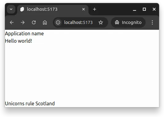
</div>Now, there is a header, a main content area, and a footer. The header contains the title of the application, the main content area contains the content of the specific page, and the footer contains a message about unicorns ruling Scotland.
At this point, the application looks something like the one in Figure 1.
Header
Let’s next focus on the header. Headers often have a background and a title, and the headers are also padded to provide some space between the content and the edges of the header.
For background, we use bg-primary-100, which is a utility class that takes the color of the theme and the intensity of the color, setting it as the background of the element. Then, we use p-4, which sets padding to the header. Finally, we also use mb-6, to add margin to the bottom of the header. The numbers in the classes indicate the amount of padding and margin, and the higher the number, the more padding and margin is added.
<script>
import "../app.css";
let { children } = $props();
</script>
<div class="flex flex-col h-full">
<header class="bg-primary-100 p-4 mb-6">
<h1>Application name</h1>
</header>
<main class="grow">
{@render children()}
</main>
<footer>
<p>Unicorns rule Scotland</p>
</footer>
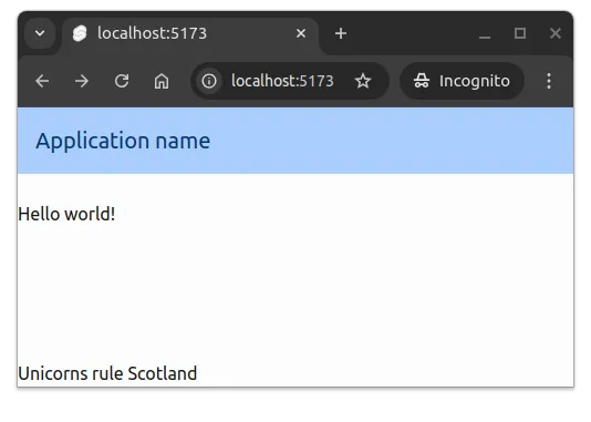
</div>Then, we adjust the size of and color of the title text, using the text-xl and text-primary-900 classes. The former sets the font size to extra large, and the latter sets the text color to the primary color of the theme.
<script>
  import "../app.css";
  let { children } = $props();
</script>

<div class="flex flex-col h-full">
  <header class="bg-primary-100 p-4 mb-6">
    <h1 class="text-xl text-primary-900">Application name</h1>
  </header>

  <main class="grow">
    {@render children()}
  </main>

  <footer>
    <p>Unicorns rule Scotland</p>
  </footer>
</div>
At this point, the application looks something like the one in Figure 2.
Footer
Let’s next focus on the footer of the application. Similar to the header, the footer often has some styling, such as padding and perhaps a line distinguishing the footer from the rest of the application. The footer also often contains a message about the application.
In our case, there’s a statement about the national animal of Scotland.
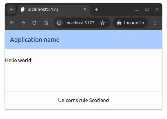
For the footer, we start with p-4 to set padding to the footer, and then use border-t-2 to add a border of width 2 at the top of the footer, and use border-gray-300 to make the border light gray. Then, for the text paragraph in the footer, we use text-center to align the text to the center of the page.
Now, the layout file looks as follows.
<script>
  import "../app.css";
  let { children } = $props();
</script>

<div class="flex flex-col h-full">
  <header class="bg-primary-100 p-4 mb-6">
    <h1 class="text-xl text-primary-900">Application name</h1>
  </header>

  <main class="grow">
    {@render children()}
  </main>

  <footer class="p-4 border-t-2 border-gray-300">
    <p class="text-center">Unicorns rule Scotland</p>
  </footer>
</div>
When we open up the application, it looks something like the one in Figure 3.
Main
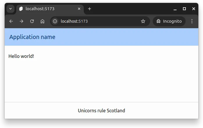
The main content area of the application is where the content of the specific page is displayed. Often, we want to ensure that the width of the main content is fixed to a certain width, and that the content is centered on the page. For this, we use the container, mx-auto, and max-w-2xl utility classes.
<script>
  import "../app.css";
  let { children } = $props();
</script>

<div class="flex flex-col h-full">
  <header class="bg-primary-100 p-4 mb-6">
    <h1 class="text-xl text-primary-900">Application name</h1>
  </header>

  <main class="container mx-auto max-w-2xl grow">
    {@render children()}
  </main>

  <footer class="p-4 border-t-2 border-gray-300">
    <p class="text-center">Unicorns rule Scotland</p>
  </footer>
</div>
The container class fixes the width of the main content area to a “certain width” that is suitable for the content, max-w-2xl sets a maximum width for the content, and mx-auto centers the area on the page.
The “certain width” relates to the concept of responsive web design, where the layout of the page adapts to the size of the screen. Responsive web design is briefly discussed in the course Device-Agnostic Design.
With the change, the application looks something like the one in Figure 4.
Navigation and links
Applications often have a navigation bar that is used for navigating between the pages. The navigation bar often contains links to the different pages of the application, and the links are often styled to indicate that they are links. The navigation bar is often a part of the header, where the links are placed inside a nav element.
As a starting point, we can use the following three links. At the moment, their href attribute value is #, which means that clicking them does not navigate out of the page.
<nav>
  <ul>
    <li><a href="#">Link 1</a></li>
    <li><a href="#">Link 2</a></li>
    <li><a href="#">Link 3</a></li>
  </ul>
</nav>
To style links, we first add the anchor class from Skeleton Typography to the a element, which defines the text color and text decoration of the link.
<nav>
  <ul>
    <li><a class="anchor" href="#">Link 1</a></li>
    <li><a class="anchor" href="#">Link 2</a></li>
    <li><a class="anchor" href="#">Link 3</a></li>
  </ul>
</nav>
Then, we add the flex class to the unordered list element, which leads to the links being displayed as a horizontal menu, and then we add the space-x-4 class to add space between the links.
<nav>
  <ul class="flex space-x-4">
    <li><a class="anchor" href="#">Link 1</a></li>
    <li><a class="anchor" href="#">Link 2</a></li>
    <li><a class="anchor" href="#">Link 3</a></li>
  </ul>
</nav>
The navigation bar is often placed inside a header element, and the links are placed inside a nav element. Let’s add the above to our header, making the full layout look as follows.
<script>
  import "../app.css";
  let { children } = $props();
</script>

<div class="flex flex-col h-full">
  <header class="bg-primary-100 p-4 mb-6">
    <h1 class="text-xl text-primary-900">Application name</h1>
    <nav>
      <ul class="flex space-x-4">
        <li><a class="anchor" href="#">Link 1</a></li>
        <li><a class="anchor" href="#">Link 2</a></li>
        <li><a class="anchor" href="#">Link 3</a></li>
      </ul>
    </nav>
  </header>

  <main class="container mx-auto max-w-2xl grow">
    {@render children()}
  </main>

  <footer class="p-4 border-t-2 border-gray-300">
    <p class="text-center">Unicorns rule Scotland</p>
  </footer>
</div>
When we open up the application, it looks something like the one in Figure 5.
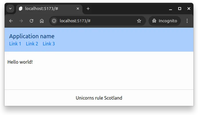
If we would wish that the links would be shown on the right side of the title, we could use the flex class in the header element to indicate that the contents should use the flex layout. In addition, as the height of the elements can differ, we can use the items-center class to align the items to the center of the header.
<header class="flex items-center bg-primary-100 p-4 mb-6">
<h1 class="text-xl text-primary-900">Application name</h1>
<nav>
<ul class="flex space-x-4">
<li><a class="anchor" href="#">Link 1</a></li>
<li><a class="anchor" href="#">Link 2</a></li>
<li><a class="anchor" href="#">Link 3</a></li>
</ul>
</nav>
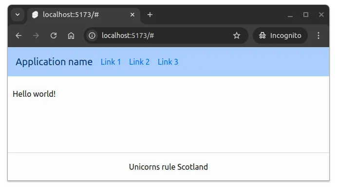
</header>With this, the menu is shown practically glued to the first link. To separate the menu from the title, we can use the ml-4 class to some margin to the left side of the menu. With all the changes, the layout looks as follows.
<script>
  import "../app.css";
  let { children } = $props();
</script>

<div class="flex flex-col h-full">
  <header class="flex items-center bg-primary-100 p-4 mb-6">
    <h1 class="text-xl text-primary-900">Application name</h1>
    <nav class="ml-4">
      <ul class="flex space-x-4">
        <li><a class="anchor" href="#">Link 1</a></li>
        <li><a class="anchor" href="#">Link 2</a></li>
        <li><a class="anchor" href="#">Link 3</a></li>
      </ul>
    </nav>
  </header>

  <main class="container mx-auto max-w-2xl grow">
    {@render children()}
  </main>

  <footer class="p-4 border-t-2 border-gray-300">
    <p class="text-center">Unicorns rule Scotland</p>
  </footer>
</div>
When opened in the browser, the application looks something like the one in Figure 6.
Layout as components
To make the layout easier to maintain, we can extract the parts of the layout into components. For layout components, we would create a separate folder called layout into the components folder of the application, and place the layout components there.
As an example, a Header.svelte file could contain the following.
<header class="flex items-center bg-primary-100 p-4 mb-6">
  <h1 class="text-xl text-primary-900">Application name</h1>
  <nav class="ml-4">
    <ul class="flex space-x-4">
      <li><a class="anchor" href="#">Link 1</a></li>
      <li><a class="anchor" href="#">Link 2</a></li>
      <li><a class="anchor" href="#">Link 3</a></li>
    </ul>
  </nav>
</header>
And a Footer.svelte file could contain the following.
<footer class="p-4 border-t-2">
  <p class="text-center">Unicorns rule Scotland</p>
</footer>
Now, if these would be in the folder src/lib/components/layout, they could be used in the layout file as follows.
<script>
  import "../app.css";

  import Header from "$lib/components/layout/Header.svelte";
  import Footer from "$lib/components/layout/Footer.svelte";

  let { children } = $props();
</script>

<div class="flex flex-col h-full">
  <Header />

  <main class="container mx-auto max-w-2xl grow">
    {@render children()}
  </main>

  <Footer />
</div>