Building Layouts with Tailwind and Skeleton
Learning Objectives
- You understand the term utility class and can use utility classes from Tailwind CSS and Skeleton to style components.
- You understand basic CSS layout concepts (flexbox and grid).
- You know how Tailwind CSS utility classes map to CSS layout properties.
- You can build common layout structures using Tailwind CSS.
- You know the common parts in a web application layout.
Utility Classes
Both Tailwind CSS and Skeleton are built on utility classes — single-purpose classes that apply specific styles to an element. Instead of writing custom CSS for each component, you compose styles by combining multiple predefined utility classes directly in your HTML.
Custom CSS to utility classes
Consider the following example that uses custom CSS for styling a button. The button has a blue background, white text, padding, and rounded corners:
With Tailwind’s utility-first approach, you can achieve the same result by combining small, focused classes:
<button class="bg-blue-600 text-white px-4 py-2 rounded-lg">
  Click me
</button>
Each utility class handles one specific style:
bg-blue-600— sets the background color to a specific shade of bluetext-white— sets the text color to whitepx-4— adds horizontal padding (left and right)py-2— adds vertical padding (top and bottom)rounded-lg— adds rounded corners
Common utility classes
Many Tailwind utility classes map directly to CSS properties. For example, text-center sets text-align: center;, text-bold sets font-weight: bold;, and m-4 class sets margin: 1rem; (0.25 rem for each point).
| Category | Utility Class | Description |
|---|---|---|
| Spacing | m-4 | Adds margin on all sides |
mt-6 | Adds margin to the top | |
p-2 | Adds padding on all sides | |
space-y-4 | Adds vertical spacing between child elements | |
| Typography | text-xl | Sets font size to extra large |
font-bold | Makes text bold | |
text-center | Centers text alignment | |
| Colors | bg-gray-100 | Sets background to light gray |
text-blue-600 | Sets text color to blue |
Building a common layout structure
Layouts
The term layout refers to the visual structure of a page and how elements are arranged. CSS provides several approaches for building layouts, with flexbox and grid being the most commonly used.
- Flexbox is designed for one-dimensional layouts — arranging items in a row or column
- Grid is designed for two-dimensional layouts — arranging items in rows and columns simultaneously
The following example shows a basic flexbox layout with CSS. The container has four child elements arranged in a row, each taking equal space:
Tailwind CSS provides utility classes for both flexbox and grid layouts. For example, flex sets display: flex, while flex-row sets flex-direction: row.
Layout structure
Most web applications share a common layout structure across pages: a header with navigation, a main content area, and a footer. This consistency helps users understand and navigate the application.
When building layouts, we use semantic HTML elements to describe the structure. The
headerelement contains the navigation, themainelement holds the page content, and thefooterprovides supplementary information.
Let’s start with a basic layout file that imports our styles and renders the page content:
<script>
  import "../app.css";
  let { children } = $props();
</script>

{@render children()}
We’ll use this simple content in +page.svelte:
<p>Hello world!</p>And the following in app.css, which ensures the layout extends to the full height of the viewport:
@import "tailwindcss";
@plugin "@tailwindcss/forms";

@import "@skeletonlabs/skeleton";
@import "@skeletonlabs/skeleton-svelte";
@import "@skeletonlabs/skeleton/themes/cerberus";

html,
body {
  @apply h-full;
}
Now let’s add the semantic structure with header, main, and footer elements — place the following to +layout.svelte:
<script>
import "../app.css";
let { children } = $props();
</script>
<header>
<span>Application name</span>
</header>
<main>
{@render children()}
</main>
<footer>
<p>Unicorns rule Scotland</p>
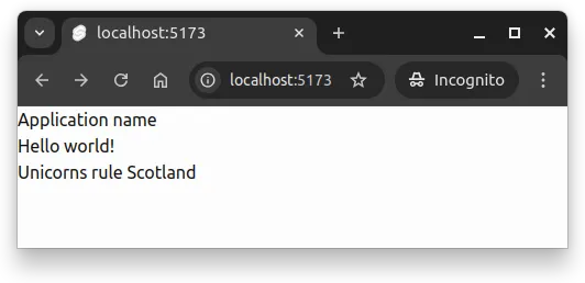
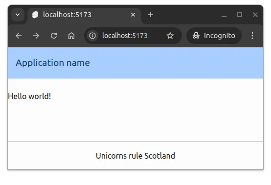
</footer>With the above in place, the application looks similar to the one shown in Figure 1 below.
Tailwind layout utilities
To create a layout where the header stays at the top, the footer at the bottom, and the main content fills the space between, we’ll use Tailwind’s flexbox utilities. We wrap everything in a div with flex (enables flexbox), flex-col (arranges children vertically), and h-full (takes full height). The grow class on main makes it expand to fill available space:
<script>
import "../app.css";
let { children } = $props();
</script>
<div class="flex flex-col h-full">
<header>
<span>Application name</span>
</header>
<main class="grow">
{@render children()}
</main>
<footer>
<p>Unicorns rule Scotland</p>
</footer>
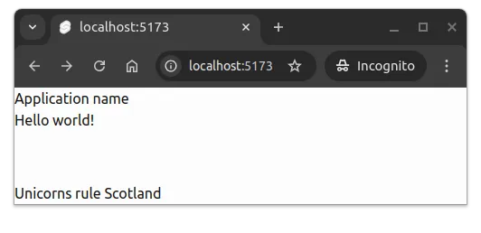
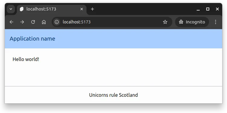
</div>Now, the application name and the main content is at the top, while the footer is at the bottom of the page. This is shown in Figure 2.
Styling the layout
Styling the header
Headers typically have a background color, padding for breathing room, and styled text. Let’s add these using Tailwind and Skeleton utilities.
The bg-primary-100 class applies a light shade from the active theme as the background. The p-4 class adds padding on all sides, and mb-6 adds margin to the bottom. The numbers in these classes indicate scale — higher numbers mean more spacing:
<script>
import "../app.css";
let { children } = $props();
</script>
<div class="flex flex-col h-full">
<header class="bg-primary-100 p-4 mb-6">
<span>Application name</span>
</header>
<main class="grow">
{@render children()}
</main>
<footer>
<p>Unicorns rule Scotland</p>
</footer>
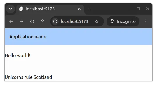
</div>Now, the application looks as shown in Figure 3.
Next, let’s style the title text. The text-lg class increases the font size, and text-primary-900 applies a dark shade from the theme:
<script>
import "../app.css";
let { children } = $props();
</script>
<div class="flex flex-col h-full">
<header class="bg-primary-100 p-4 mb-6">
<span class="text-lg text-primary-900">Application name</span>
</header>
<main class="grow">
{@render children()}
</main>
<footer>
<p>Unicorns rule Scotland</p>
</footer>
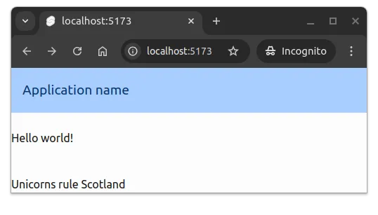
</div>The header now has visual distinction from the rest of the page, as shown in Figure 4.
Styling the footer
Footers typically have padding and a visual separator from the main content. Let’s add p-4 for padding, border-t-2 for a top border, and border-gray-300 for a light gray border color. We’ll center the text using text-center:
In our case, the footer contains a statement about the national animal of Scotland.
<script>
  import "../app.css";
  let { children } = $props();
</script>

<div class="flex flex-col h-full">
  <header class="bg-primary-100 p-4 mb-6">
    <span class="text-lg text-primary-900">Application name</span>
  </header>

  <main class="grow">
    {@render children()}
  </main>

  <footer class="p-4 border-t-2 border-gray-300">
    <p class="text-center">Unicorns rule Scotland</p>
  </footer>
</div>
The footer now has clear visual separation and centered text, as shown in Figure 5.
Styling the main content area
The main content area typically has constrained width and is centered on the page. This prevents text from stretching too wide on large screens, which improves readability.
We’ll use three Tailwind utilities: container provides responsive width constraints, mx-auto centers the content horizontally, and max-w-2xl sets a maximum width:
<script>
  import "../app.css";
  let { children } = $props();
</script>

<div class="flex flex-col h-full">
  <header class="bg-primary-100 p-4 mb-6">
    <span class="text-lg text-primary-900">Application name</span>
  </header>

  <main class="container mx-auto max-w-2xl grow">
    {@render children()}
  </main>

  <footer class="p-4 border-t-2 border-gray-300">
    <p class="text-center">Unicorns rule Scotland</p>
  </footer>
</div>
The width constraints adapt based on screen size, following responsive web design principles. We’ll explore responsive design further in the next section.
The main content is now centered and constrained, as shown in Figure 6.
Adding navigation
Most applications need a navigation menu with links to different pages. We’ll place this inside the header using a nav element with a list of links.
Let’s start with a basic navigation structure:
<nav>
  <ul>
    <li><a href="#">Link 1</a></li>
    <li><a href="#">Link 2</a></li>
    <li><a href="#">Link 3</a></li>
  </ul>
</nav>
To style the links, we’ll use the anchor class from Skeleton Typography, which provides link colors and decorations:
<nav>
  <ul>
    <li><a class="anchor" href="#">Link 1</a></li>
    <li><a class="anchor" href="#">Link 2</a></li>
    <li><a class="anchor" href="#">Link 3</a></li>
  </ul>
</nav>
To arrange the links horizontally, we’ll add flex to the list, and use space-x-4 to add spacing between items:
<nav>
  <ul class="flex space-x-4">
    <li><a class="anchor" href="#">Link 1</a></li>
    <li><a class="anchor" href="#">Link 2</a></li>
    <li><a class="anchor" href="#">Link 3</a></li>
  </ul>
</nav>
Now let’s add this navigation to our header:
<script>
import "../app.css";
let { children } = $props();
</script>
<div class="flex flex-col h-full">
<header class="bg-primary-100 p-4 mb-6">
<span class="text-lg text-primary-900">Application name</span>
<nav>
<ul class="flex space-x-4">
<li><a class="anchor" href="#">Link 1</a></li>
<li><a class="anchor" href="#">Link 2</a></li>
<li><a class="anchor" href="#">Link 3</a></li>
</ul>
</nav>
</header>
<main class="container mx-auto max-w-2xl grow">
{@render children()}
</main>
<footer class="p-4 border-t-2 border-gray-300">
<p class="text-center">Unicorns rule Scotland</p>
</footer>
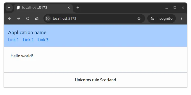
</div>The navigation now appears below the title, as shown in Figure 7.
To place the navigation beside the title instead, we’ll use flexbox on the header itself. Adding flex makes the header a flex container, and items-center vertically centers the title and navigation:
<header class="flex items-center bg-primary-100 p-4 mb-6">
<span class="text-lg text-primary-900">Application name</span>
<nav>
<ul class="flex space-x-4">
<li><a class="anchor" href="#">Link 1</a></li>
<li><a class="anchor" href="#">Link 2</a></li>
<li><a class="anchor" href="#">Link 3</a></li>
</ul>
</nav>
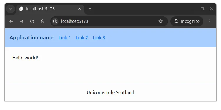
</header>The navigation is now beside the title, but sits directly against it. Let’s add ml-4 to the nav to add space between them:
<script>
  import "../app.css";
  let { children } = $props();
</script>

<div class="flex flex-col h-full">
  <header class="flex items-center bg-primary-100 p-4 mb-6">
    <span class="text-lg text-primary-900">Application name</span>
    <nav class="ml-4">
      <ul class="flex space-x-4">
        <li><a class="anchor" href="#">Link 1</a></li>
        <li><a class="anchor" href="#">Link 2</a></li>
        <li><a class="anchor" href="#">Link 3</a></li>
      </ul>
    </nav>
  </header>

  <main class="container mx-auto max-w-2xl grow">
    {@render children()}
  </main>

  <footer class="p-4 border-t-2 border-gray-300">
    <p class="text-center">Unicorns rule Scotland</p>
  </footer>
</div>
The navigation is now properly positioned beside the title, as shown in Figure 8.
Extracting layout components
To make the layout easier to maintain, we can extract parts into separate components. Layout components typically go in a layout folder inside the src/lib/components directory.
For example, a Header.svelte file might contain:
<header class="flex items-center bg-primary-100 p-4 mb-6">
  <span class="text-lg text-primary-900">Application name</span>
  <nav class="ml-4">
    <ul class="flex space-x-4">
      <li><a class="anchor" href="#">Link 1</a></li>
      <li><a class="anchor" href="#">Link 2</a></li>
      <li><a class="anchor" href="#">Link 3</a></li>
    </ul>
  </nav>
</header>
And a Footer.svelte file might contain:
<footer class="p-4 border-t-2 border-gray-300">
  <p class="text-center">Unicorns rule Scotland</p>
</footer>
With these components in src/lib/components/layout, the layout file becomes cleaner and easier to read:
<script>
  import "../app.css";

  import Header from "$lib/components/layout/Header.svelte";
  import Footer from "$lib/components/layout/Footer.svelte";

  let { children } = $props();
</script>

<div class="flex flex-col h-full">
  <Header />

  <main class="container mx-auto max-w-2xl grow">
    {@render children()}
  </main>

  <Footer />
</div>
This component-based approach makes it easier to maintain and update layout elements, and allows you to reuse layout components across different parts of your application.
Summary
In summary:
- Utility classes allow styling elements by combining small, focused classes directly in HTML.
- Layouts are commonly built using flexbox and/or grid techniques that arrange elements in rows and columns.
- Web applications often have a common layout structure with a header, main content area, and footer.
- Tailwind CSS provides numerous utility classes for styling layout elements, including spacing, colors, and typography.
- Extracting layout parts into components can improve maintainability and reusability.