Styling an Application
Learning Objectives
- You can style forms and components using Tailwind CSS and Skeleton.
- You know how to use Skeleton’s pre-built Svelte components.
- You understand how to apply transitions and animations.
In the previous chapters, we built a basic layout and learned how to make it responsive. Now we’ll look back into styling the book application that we’ve worked with previously.
We’ll start by styling the layout to display user authentication information, then move to forms for login and adding books, and finally style the book display with cards.
Layout with user authentication
Let’s start with our layout file, which currently displays user information without any styling. Here’s what we’re working with:
<script>
import { useAuthState } from "$lib/states/authState.svelte.js";
let { children } = $props();
const authState = useAuthState();
</script>
<header>
{#if authState.user}
<div>
<span>
Hello, {authState.user.email}!
{#if authState.user.roles?.length}
(Roles: {authState.user.roles.join(", ")})
{/if}
</span>
{#if authState.user.roles?.includes("ADMIN")}
<ul>
<li><a href="/admin">Admin</a></li>
</ul>
{/if}
<button onclick={() => authState.logout()}>Logout</button>
</div>
{:else}
<ul>
<li><a href="/auth/login">Login</a></li>
<li><a href="/auth/register">Register</a></li>
</ul>
{/if}
</header>
<main>
{@render children()}
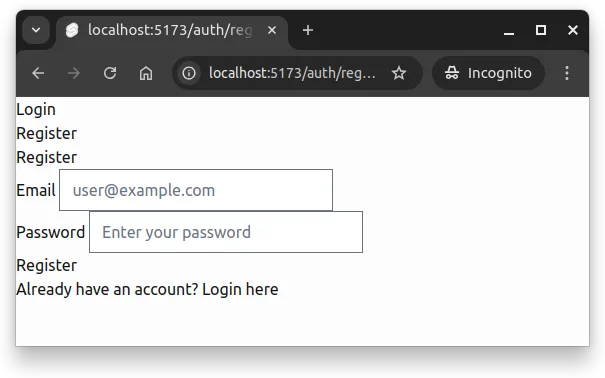
</main>When we open up the application and navigate to the path auth/register, we see a very basic layout with a form without any styling. This is shown in Figure 1 below.
Let’s apply what we learned in the previous chapters about building layouts with Tailwind.
Header component
First, we’ll create a component for the header to keep things organized. Create a component called Header.svelte to src/lib/components/layout (creating the folder if it does not yet exist), and place the following content to it. The header will show a title “Booksy” and the user’s email if they are logged in, while otherwise it will show login and registration links.
<script>
  import { useAuthState } from "$lib/states/authState.svelte.js";
  const authState = useAuthState();
</script>

<header class="flex items-center bg-primary-100 p-4 mb-6">
  <span class="text-lg text-primary-900">
    Booksy
    {#if authState.user}
      ({authState.user.email})
    {/if}
  </span>
  <nav class="ml-4">
    <ul class="flex space-x-4">
      {#if authState.user}
        <li>
          <button class="anchor" onclick={() => authState.logout()}>
            Logout
          </button>
        </li>
      {:else}
        <li><a class="anchor" href="/auth/login">Login</a></li>
        <li><a class="anchor" href="/auth/register">Register</a></li>
      {/if}
    </ul>
  </nav>
</header>
For handling authentication state, we import and use the useAuthState function from our shared state — this way, the header can reactively update based on whether the user is logged in or not, and the layout does not need to know about authentication details.
Layout file
Then, modify the layout file to use this new Header component and add styling to it. Update src/routes/+layout.svelte as follows:
<script>
  import "../app.css";
  import Header from "$lib/components/layout/Header.svelte";

  let { children } = $props();
</script>

<div class="flex flex-col h-full">
  <Header />

  <main class="container mx-auto max-w-4xl px-4 grow">
    {@render children()}
  </main>
</div>
Now, the layout file is cleaner, and the header is encapsulated in its own component. Furthermore, we added some Tailwind classes to the main element to center the content and limit its maximum width.
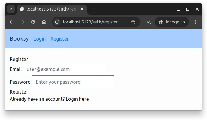
At this point, if you refresh the registration page, you should see a more structured layout with a styled header, as shown in Figure 2 below.
Styling the authentication forms
Next, let’s style the login and registration forms. Here’s our starting point:
<script>
  /* logic */
</script>

<h2>
  {page.params.action === "login" ? "Login" : "Register"}
</h2>

{#if message}
  <div>
    <p>{message}</p>
  </div>
{/if}

{#if errorMessage}
  <div>
    <p>{errorMessage}</p>
  </div>
{/if}

<form onsubmit={handleForm}>
  <label>
    <span>Email</span>
    <input
      id="email"
      name="email"
      type="email"
      placeholder="user@example.com"
      required
    />
  </label>
  <br />
  <label>
    <span>Password</span>
    <input
      id="password"
      name="password"
      type="password"
      placeholder="Enter your password"
      required
    />
  </label>
  <br />
  <button type="submit" disabled={isLoading}>
    {isLoading
      ? "Please wait..."
      : page.params.action === "login"
        ? "Login"
        : "Register"}
  </button>
</form>

{#if page.params.action === "login"}
  <p>
    Don't have an account? <a href="/auth/register">Register here</a>
  </p>
{:else}
  <p>
    Already have an account? <a href="/auth/login">Login here</a>
  </p>
{/if}
We can use Skeleton’s utility classes for the form elements to give them a polished look, and also apply Tailwind classes for layout and spacing.
Let’s style this form using Tailwind utilities and Skeleton’s CSS classes:
<script>
/* logic */
</script>
<div class="max-w-md mx-auto">
<h2 class="text-2xl font-bold text-primary-900 mb-6">
{page.params.action === "login" ? "Login" : "Register"}
</h2>
{#if message}
<div class="card preset-filled-success p-4 mb-4">
<p>{message}</p>
</div>
{/if}
{#if errorMessage}
<div class="card preset-filled-error p-4 mb-4">
<p>{errorMessage}</p>
</div>
{/if}
<form onsubmit={handleForm} class="space-y-4">
<label class="label">
<span class="label-text">Email</span>
<input
class="input"
id="email"
name="email"
type="email"
placeholder="user@example.com"
required
/>
</label>
<label class="label">
<span class="label-text">Password</span>
<input
class="input"
id="password"
name="password"
type="password"
placeholder="Enter your password"
required
/>
</label>
<button
class="w-full btn preset-filled-primary-500"
type="submit"
disabled={isLoading}
>
{isLoading
? "Please wait..."
: page.params.action === "login"
? "Login"
: "Register"}
</button>
</form>
<p class="text-center mt-6 text-sm">
{#if page.params.action === "login"}
Don't have an account?
<a class="anchor" href="/auth/register"> Register here </a>
{:else}
Already have an account?
<a class="anchor" href="/auth/login"> Login here </a>
{/if}
</p>
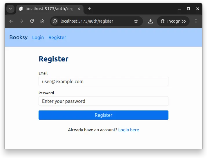
</div>Now, the form is centered, has proper spacing, and uses consistent theming throughout. Figure 3 below shows the styled registration page.
Styling the book form
Now let’s style the form for adding books. Here’s the unstyled version of BookForm.svelte:
<script>
import { useBookState } from "$lib/states/bookState.svelte.js";
let bookState = useBookState();
const addBook = (e) => {
e.preventDefault();
const book = Object.fromEntries(new FormData(e.target));
bookState.addBook(book);
e.target.reset();
};
</script>
<form onsubmit={addBook}>
<label>
Title
<input
id="title"
name="title"
type="text"
placeholder="Book title"
/>
</label>
<br />
<label>
Description
<textarea
id="description"
name="description"
placeholder="Enter book description"
></textarea>
</label>
<br />
<label>
Published at
<input id="published_at" name="published_at" type="date" />
</label>
<br />
<label>
Page count
<input id="page_count" name="page_count" type="number" />
</label>
<br />
<input type="submit" value="Add Book" />
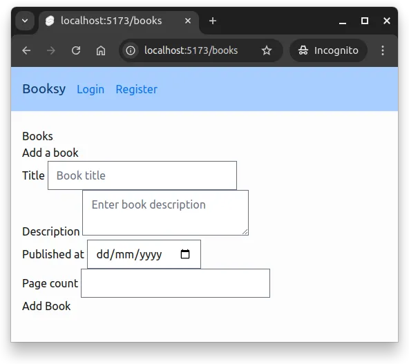
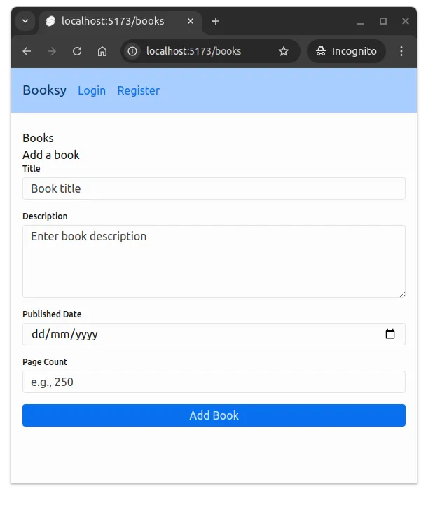
</form>With the existing styles, the page at /books looks similar to the Figure 4 below.
Let’s apply similar styling to what we used for the authentication form:
<script>
  import { useBookState } from "$lib/states/bookState.svelte.js";

  let bookState = useBookState();

  const addBook = (e) => {
    e.preventDefault();

    const book = Object.fromEntries(new FormData(e.target));
    bookState.addBook(book);
    e.target.reset();
  };
</script>

<form onsubmit={addBook} class="space-y-4">
  <label class="label">
    <span class="label-text">Title</span>
    <input
      class="input"
      id="title"
      name="title"
      type="text"
      placeholder="Book title"
      required
    />
  </label>

  <label class="label">
    <span class="label-text">Description</span>
    <textarea
      class="input"
      id="description"
      name="description"
      placeholder="Enter book description"
      rows="4"
    ></textarea>
  </label>

  <div class="grid grid-cols-1 md:grid-cols-2 gap-4">
    <label class="label">
      <span class="label-text">Published Date</span>
      <input
        class="input"
        id="published_at"
        name="published_at"
        type="date"
        required
      />
    </label>

    <label class="label">
      <span class="label-text">Page Count</span>
      <input
        class="input"
        id="page_count"
        name="page_count"
        type="number"
        min="1"
        placeholder="e.g., 250"
        required
      />
    </label>
  </div>

  <button class="w-full btn preset-filled-primary-500" type="submit">
    Add Book
  </button>
</form>
Now, the input fields are styled using Skeleton’s label, label-text, and input classes, and the form has proper spacing and layout. Figure 5 below shows the styled book addition form.
Displaying Books with Cards
Now let’s adjust the functionality used display the list of books. Let’s start with the following BookList.svelte component.
<script>
  import { useBookState } from "$lib/states/bookState.svelte.js";

  let bookState = useBookState();
</script>

<ul>
  {#each bookState.books as book}
    <li>
      <a href={`/books/${book.id}`}>{book.title}</a>
      <button onclick={() => bookState.removeBook(book)}>Remove</button>
    </li>
  {/each}
</ul>
We’ll use Skeleton’s card class to create visually distinct book entries with links and delete functionality. Modify the BookList.svelte to match the following:
<script>
import { useBookState } from "$lib/states/bookState.svelte.js";
let bookState = useBookState();
</script>
{#if bookState.books.length === 0}
<div class="text-center py-12">
<p class="text-4xl mb-4">📚</p>
<p class="text-lg text-surface-600 mb-2">The library is empty</p>
<p class="text-sm text-surface-500">Add a book to get started!</p>
</div>
{:else}
<ul class="space-y-4">
{#each bookState.books as book (book.id)}
<li class="card border-2 border-surface-300">
<div class="flex items-center justify-between p-4 gap-4">
<div class="flex-grow min-w-0">
<a href={`/books/${book.id}`} class="anchor text-lg font-semibold">
{book.title}
</a>
{#if book.description}
<p class="text-sm text-surface-600 mt-1 line-clamp-2">
{book.description}
</p>
{/if}
<div class="flex flex-wrap gap-3 mt-2 text-sm text-surface-700">
{#if book.published_at}
<span>📅 {new Date(book.published_at).toLocaleDateString()}</span>
{/if}
{#if book.page_count}
<span>📖 {book.page_count} pages</span>
{/if}
</div>
</div>
<button
class="btn"
onclick={() => bookState.removeBook(book)}
>
🗑️ Remove
</button>
</div>
</li>
{/each}
</ul>
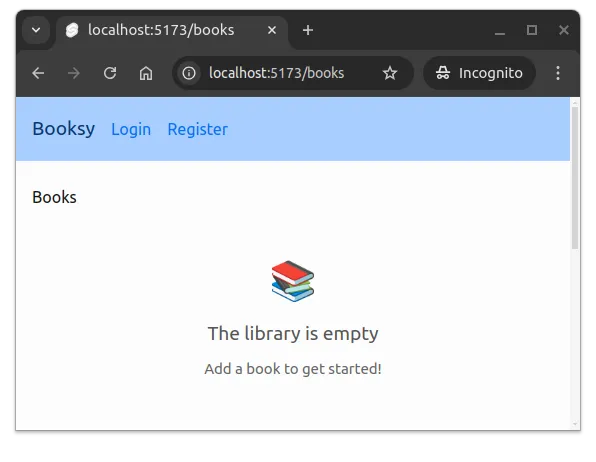
{/if}Now, when the book list is empty, the user sees a friendly empty state message with an icon. This is shown in Figure 6 below.
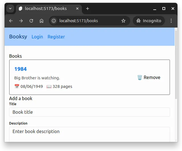
When books are added, the list displays them as cards with a title, description, publication date, and the number of pages. A sample card is shown in Figure 7 below.
Finally, let’s adjust the page that uses this component to display the list of books. Update the styles of the in the heading elements in src/routes/books/+page.svelte to match the following:
<script>
import { initBooks } from "$lib/states/bookState.svelte.js";
import BookForm from "$lib/components/books/BookForm.svelte";
import BookList from "$lib/components/books/BookList.svelte";
$effect(() => {
initBooks();
});
</script>
<h1 class="text-2xl font-bold text-primary-900 mb-4 mt-4">Books</h1>
<BookList />
<h2 class="text-2xl font-bold text-primary-900 mb-4 mt-4">Add a book</h2>
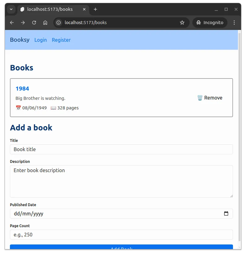
<BookForm />Now, the headings are styled consistently with the rest of the application. Figure 8 below shows the styled books page with one book entry.
Here, we just got started with styling, and there would be plenty of other places in the application that could use some styling as well, such as the book details page, chapter listing, and chapter forms. Feel free to explore and apply similar styling techniques to those parts of the application!
Summary
In summary:
- Component organization improves maintainability. Extract reusable UI elements like headers into separate components to keep layout files clean and focused.
- Skeleton provides pre-built utility classes for common UI elements like forms, buttons, and cards. Use classes like
input,label,btn, andcardfor consistent styling across your application. - Tailwind utility classes control layout and spacing. Combine Skeleton’s component styles with Tailwind classes like
flex,space-y-4,max-w-md, andmx-autofor responsive, well-structured interfaces. - Empty states enhance user experience. Display friendly messages with icons when lists or collections are empty to guide users toward their next action.
- Cards group related information visually. Use Skeleton’s
cardclass to create distinct visual containers for displaying collections of data like book entries. - Consistent styling creates cohesive applications. Apply the same design patterns across forms, headers, and content sections to maintain visual harmony throughout your application.