Responsive Web Design
Learning Objectives
- You understand the concept of responsive web design.
- You know how Tailwind’s responsive utilities work.
- You can build layouts that adapt to different screen sizes using Tailwind.
Responsive Web Design
The term Responsive Web Design was coined by Ethan Marcotte, who outlined techniques that allow web pages to adapt to different screen sizes and orientations. The goal is to provide a good user experience whether someone visits your site on a phone, tablet, or desktop computer.
This differs from adaptive design, which focuses on creating separate fixed layouts for specific screen sizes. While adaptive design was common in the early mobile era, responsive design has become the standard approach.
Responsive design uses CSS to create flexible layouts that adjust based on available space. Under the hood, responsive design relies on media queries and container queries — CSS rules that apply styles based on device characteristics like screen width for media queries, or the size of a parent container for container queries.
A basic media query that applies a light gray background when the viewport width is 480 pixels or less might look like this:
@media (max-width: 480px) {
  body {
    background-color: lightgray;
  }
}
You can try it in the following HTML view — if you make the window narrower than 480 pixels, the background turns light gray.
Tailwind’s responsive utility classes
Tailwind CSS abstracts away the need to write media queries directly. Instead, you use responsive utility classes that automatically apply at different screen sizes. This makes responsive design faster and more consistent.
In Tailwind, unprefixed utilities apply at all screen sizes. Prefixed utilities (like md: or lg:) only apply at that breakpoint and above. For example:
text-center— centers text on all screen sizesmd:text-left— aligns text left on medium screens and abovelg:text-xl— increases font size on large screens and above
Tailwind’s default breakpoints are:
sm: 640pxmd: 768pxlg: 1024pxxl: 1280px2xl: 1536px
As an example, md:p-4 applies padding of 4 (1rem) on screens 768px wide and larger, while smaller screens receive no padding from that class. Similarly, using p-2 md:p-4 applies padding of 2 (0.5rem) on small screens and 4 (1rem) on medium screens and above.
Making elements responsive
Let’s start with a simple example. Modify your +page.svelte file to match the following:
<h1 class="p-1 text-xl md:text-2xl lg:text-4xl">Hello world!</h1>On all screen sizes, the heading has padding of p-1. The text size changes based on screen width; on small screens, it’s text-xl, on medium screens it becomes text-2xl, and on large screens it grows to text-4xl.
This demonstrates responsive typography, where text size adapts to the available screen space for better readability.
When you run the application locally and adjust the size of the window, you’ll see the text size change accordingly. As an example, in Figure 1 below, the width of the screen is over 768 pixels, so the md:text-2xl class is applied.
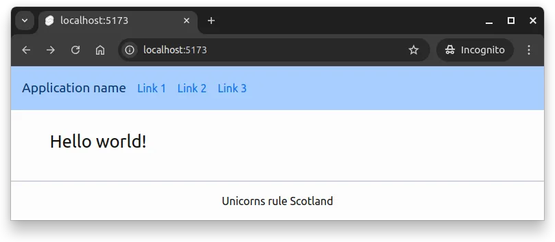
md:text-2xl class is applied.When building responsive designs, test them at different screen sizes. Most browsers include developer tools with device simulation: (1) Open your browser’s developer tools (usually F12), (2) Enable device/responsive mode, and (3) Test various screen sizes and devices.
You may also just resize your browser window manually to see how your layout responds. When testing the layout, look for text that is readable, elements that are well spaced, and that no content is cut off or overlapping.
Responsive layout patterns
Stacking and unstacking
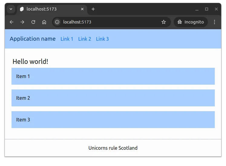
One of the most common responsive patterns is stacking elements vertically on mobile and arranging them horizontally on larger screens. With Tailwind’s flexbox utilities, this is straightforward:
<div class="flex flex-col md:flex-row gap-4">
  <div class="bg-primary-100 p-4">Item 1</div>
  <div class="bg-primary-100 p-4">Item 2</div>
  <div class="bg-primary-100 p-4">Item 3</div>
</div>
On mobile, flex-col stacks items vertically. On medium screens and above, md:flex-row arranges them horizontally. The gap-4 utility adds consistent spacing in both layouts. Figure 2 below shows what the layout looks like on a small screen, when the list has is below the title.
flex-col class is applied and the items are stacked vertically.Responsive grid columns
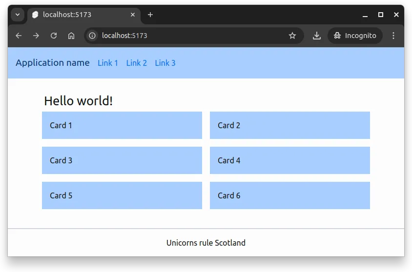
Grid layouts naturally adapt to different screen sizes. You can specify different column counts at different breakpoints:
<div class="grid grid-cols-1 md:grid-cols-2 lg:grid-cols-3 gap-4">
  <div class="bg-primary-100 p-4">Card 1</div>
  <div class="bg-primary-100 p-4">Card 2</div>
  <div class="bg-primary-100 p-4">Card 3</div>
  <div class="bg-primary-100 p-4">Card 4</div>
  <div class="bg-primary-100 p-4">Card 5</div>
  <div class="bg-primary-100 p-4">Card 6</div>
</div>
This creates one column on mobile, two columns on tablets, and three columns on desktops. As you resize your browser, you’ll see the layout adjust automatically. Figure 3 below shows what the layout looks like on a medium screen, when the list has two columns.
md:grid-cols-2 class applies and the grid has two columns.Showing and hiding elements
Sometimes you want to show or hide elements based on screen size. Tailwind provides hidden and responsive display utilities:
<nav>
  <!-- Mobile menu button - only shown on small screens -->
  <button class="md:hidden">Menu</button>

  <!-- Full navigation - hidden on small screens -->
  <ul class="hidden md:flex gap-4">
    <li><a href="#">Home</a></li>
    <li><a href="#">About</a></li>
    <li><a href="#">Contact</a></li>
  </ul>
</nav>
The button appears only on small screens (thanks to md:hidden). The navigation list is hidden on small screens (hidden) but displays as a flex container on medium screens and above (md:flex).
Making our layout responsive
Let’s revisit the header from the previous chapter and make it responsive. Currently, the title and navigation sit side by side, which doesn’t work well on small screens.
Here’s our starting point:
<header class="flex items-center bg-primary-100 p-4 mb-6">
  <h1 class="text-xl text-primary-900">Application name</h1>
  <nav class="ml-4">
    <ul class="flex space-x-4">
      <li><a class="anchor" href="#">Link 1</a></li>
      <li><a class="anchor" href="#">Link 2</a></li>
      <li><a class="anchor" href="#">Link 3</a></li>
    </ul>
  </nav>
</header>
On mobile, we want the navigation below the title. On larger screens, we want them side by side. We can accomplish this by making the header flex direction responsive:
<header
  class="flex flex-col sm:flex-row sm:items-center bg-primary-100 p-4 mb-6"
>
  <span class="text-xl text-primary-900">Application name</span>
  <nav class="mt-2 sm:mt-0 sm:ml-4">
    <ul class="flex space-x-4">
      <li><a class="anchor" href="#">Link 1</a></li>
      <li><a class="anchor" href="#">Link 2</a></li>
      <li><a class="anchor" href="#">Link 3</a></li>
    </ul>
  </nav>
</header>
The changes:
flex-colstacks items vertically on mobilesm:flex-rowarranges items horizontally on small screens and abovesm:items-centercenters items vertically, but only on small screens and abovemt-2adds top margin to the nav on mobilesm:mt-0 sm:ml-4removes top margin and adds left margin on small and above
We might also want to adjust the main content width for different screen sizes:
<main class="container mx-auto max-w-sm md:max-w-2xl lg:max-w-4xl grow">
  {@render children()}
</main>
This gives us a smaller maximum width on mobile (max-w-sm), a medium width on tablets (md:max-w-2xl), and a larger width on desktops (lg:max-w-4xl).
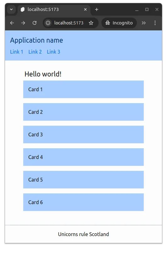
Now, when the application is viewed on a small screen, the header elements stack vertically, and the main content is sized for readability. This is shown in Figure 4 below.
Summary
In summary:
- Responsive web design focuses on creating user interfaces that adapt to different screen sizes and orientations.
- Tailwind CSS provides responsive utility classes that allow changing styles based on breakpoints without writing media queries directly.
- Common responsive patterns include stacking/unstacking elements, adjusting grid columns, and showing/hiding content based on screen size.