Theming and Design Consistency
Learning Objectives
- You understand the importance of consistent styling in applications.
- You know how to use CSS variables for theming.
- You can create and apply themes using Tailwind CSS and Skeleton.
In the previous chapter, we styled individual components and forms for our book application. While each styled piece looked quite acceptable in isolation, professional applications require consistency across all its parts.
Users should feel like they’re using a cohesive product, not a collection of unrelated components.
This chapter explores how to achieve styling consistency through theming, design systems, and consistent patterns. We’ll also look at how Tailwind and Skeleton help maintain consistency.
Consistency matters
Consistency affects how users experience the application. When buttons, forms, and navigation elements behave consistently, users learn patterns that they can apply throughout the application.
If a button in one location behaves differently than a button in another location, users will get confused which can undermine the trust in the application.
Consistency can also help development. When developers follow established patterns, they can build new features faster and with fewer errors. For instance, when you need to update the styles of a button, having a single source of truth means you only need to change it in one place.
Consider two scenarios. In the first, every page uses slightly different heading sizes, button styles, and spacing. Developers make styling decisions for each new component, eventually leading to divergence in styling. In the second, the team follows established patterns using a design system, making styling decisions more predictable.
A design system is a collection of reusable components, patterns, and guidelines that ensure consistency across an application.
Theming and CSS variables
Much of theming at the CSS level relies on CSS variables. CSS variables (also called custom properties) provide a way to store and reuse values in stylesheets.
Declaring and accessing CSS variables
CSS variables are declared with a -- prefix and accessed using the var() function. In the following, we declare some color variables using the :root selector that makes them globally available:
:root {
  --primary-color: #3b82f6;
  --text-color: #1f2937;
  --background-color: #ffffff;
}

button {
  background-color: var(--primary-color);
  color: var(--background-color);
}

body {
  color: var(--text-color);
  background-color: var(--background-color);
}
Now, a button element will use the --primary-color variable for its background color and --background-color for its text color, and the documents will use --text-color and --background-color for text and background colors, respectively.
The colors
#3b82f6and#1f2937correspond toblue-500andgray-800in Tailwind’s colors.
Creating multiple themes
CSS variables help creating multiple themes. You can define different color schemes and switch between them by changing a class or attribute. One approach is using a data-theme attribute on the HTML element, which can be targeted in CSS:
/* Light theme (default) */
:root {
  --primary-color: #3b82f6;
  --background-color: #ffffff;
  --text-color: #1f2937;
}

/* Dark theme */
[data-theme="dark"] {
  --primary-color: #60a5fa;
  --background-color: #1f2937;
  --text-color: #f9fafb;
}

/* Use the variables */
body {
  background-color: var(--background-color);
  color: var(--text-color);
}

button {
  background-color: var(--primary-color);
}
With the above style that applies different variable values based on the data-theme attribute, you can switch between light and dark themes. To concretely switch the themes themes, change the data-theme attribute on your HTML element:
<!-- Light theme -->
<html data-theme="light">

<!-- Dark theme -->
<html data-theme="dark">
Remember how we added the
data-themeattribute to ourapp.htmlwhen taking Skeleton into use — this is the same mechanism.
Design tokens
TailwindCSS — and more broadly design systems like Material Design, Fluent, etc — use design tokens. Design tokens are named values that represent design decisions.
The difference between CSS variables and design tokens is that CSS variables are a technical mechanism, while design tokens are a conceptual approach to design consistency.
Rather than using colors directly, you use semantic names:
:root {
  /* Color palette */
  --color-blue-500: #3b82f6;
  --color-blue-600: #2563eb;
  --color-gray-50: #f9fafb;
  --color-gray-900: #111827;

  /* Semantic tokens */
  --color-primary: var(--color-blue-500);
  --color-primary-hover: var(--color-blue-600);
  --color-background: var(--color-gray-50);
  --color-text: var(--color-gray-900);

  /* Spacing scale */
  --space-1: 0.25rem;
  --space-2: 0.5rem;
  --space-4: 1rem;
  --space-8: 2rem;

  /* Typography */
  --font-size-sm: 0.875rem;
  --font-size-base: 1rem;
  --font-size-lg: 1.125rem;
  --font-size-xl: 1.25rem;
}
Design tokens are CSS variables that provide a layer of abstraction to design. Instead of declaring specific style values when designing components, e.g. color: #3b82f6, you use a design tokens for defining the style, e.g. color: var(--color-primary). This makes updates easier — ideally, changing your primary color should require updating just one variable.
Theming with Tailwind CSS and Skeleton
Tailwind CSS and Skeleton build upon CSS variables. Rather than manually defining variables, you work with a structured configuration that generates classes automatically.
Skeleton provides several built-in themes. To use them, first ensure your app.css imports the theme:
@import "tailwindcss";
@import "@skeletonlabs/skeleton";
@import "@skeletonlabs/skeleton/themes/cerberus";
Then set the theme in your app.html:
<html lang="en" data-theme="cerberus">
  <head>
    <!-- ... -->
  </head>
  <body>
    <!-- ... -->
  </body>
</html>
The data-theme attribute tells Skeleton which theme to use. Skeleton’s theme gallery outlines available themes like cerberus, concord, and wintry — each theme also comes with its own light and dark mode variants.
Skeleton also has a theme generator that allows creating new themes from scratch.
Dynamically adjusting themes
To concretely showcase how theming can be adjusted, let’s first build a theme switcher that allows users to select their preferred theme. Then, we’ll build a dark mode toggle.
Theme switcher
Switching themes dynamically requires changing the data-theme attribute on the html element. If you earlier took Skeleton into use, the app.html should contain a data-theme attribute like this:
<html lang="en" data-theme="cerberus">To create a theme switcher, we need to modify and load the value for the data-theme attribute dynamically — for storing it, we’ll use localStorage so that the preference persists.
Create a folder called themes under src/lib/components/, and then create a component ThemeSwitcher.svelte inside it. The component will provide a dropdown for selecting themes and update the data-theme attribute accordingly.
<script>
  import { browser } from "$app/environment";

  const themes = ["cerberus", "wintry"];
  let currentTheme = $state("cerberus");

  if (browser) {
    currentTheme = localStorage.getItem("theme") || "cerberus";
    document.documentElement.setAttribute("data-theme", currentTheme);
  }

  const setTheme = (theme) => {
    currentTheme = theme;
    if (browser) {
      document.documentElement.setAttribute("data-theme", theme);
      localStorage.setItem("theme", theme);
    }
  };
</script>

<select
  class="select select-sm"
  value={currentTheme}
  onchange={(e) => setTheme(e.target.value)}
>
  {#each themes as theme}
    <option value={theme}>
      Theme: {theme.charAt(0).toUpperCase() + theme.slice(1)}
    </option>
  {/each}
</select>
Then, modify the Header.svelte to include the ThemeSwitcher component. The ml-auto class fills in the remaining space to the left, pushing the theme switcher to the right side of the header.
<script>
import ThemeSwitcher from "../themes/ThemeSwitcher.svelte";
import { useAuthState } from "$lib/states/authState.svelte.js";
const authState = useAuthState();
</script>
<header class="flex items-center bg-primary-100 p-4 mb-6">
<span class="text-lg text-primary-900">
Booksy
{#if authState.user}
({authState.user.email})
{/if}
</span>
<nav class="ml-4">
<ul class="flex space-x-4">
{#if authState.user}
<li>
<button class="anchor" onclick={() => authState.logout()}>
Logout
</button>
</li>
{:else}
<li><a class="anchor" href="/auth/login">Login</a></li>
<li><a class="anchor" href="/auth/register">Register</a></li>
{/if}
</ul>
</nav>
<div class="ml-auto">
<ThemeSwitcher />
</div>
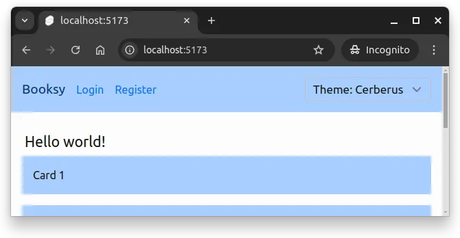
</header>Now, when you open the application, it should look similar to the one in Figure 1 below.
When you change the style, you’ll see the theme update. However, although the theme changes, the theme is not correct.
To include the theme to the application, we need to modify the app.css to include all themes that we want to support. Update the app.css to import both themes:
@import "tailwindcss";
@plugin "@tailwindcss/forms";
@import "@skeletonlabs/skeleton";
@import "@skeletonlabs/skeleton-svelte";
@import "@skeletonlabs/skeleton/themes/cerberus";
@import "@skeletonlabs/skeleton/themes/wintry";
html,
body {
@apply h-full;
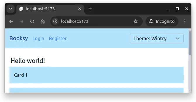
}Now, when you switch themes, the application updates accordingly. Figure 2 below shows the application after switching to the wintry theme.
Now, users can select their preferred theme from the dropdown, and the application updates accordingly.
Flash of default styled content
When the application first loads, you might notice a brief flash of the default theme before the selected theme is applied. This relates to the Flash of Unstyled Content (FOUC) phenomenon in web development.
The underlying issue is that the initial render uses the default theme defined in app.html. The theme is set to cerberus there, and changed in the ThemeSwitcher component based on the value stored in localStorage. As a result, the page first loads with the default theme and changes it only after the JavaScript in the ThemeSwitcher component is executed.
To avoid this, you can add a small inline script in app.html that reads the theme from localStorage and sets the data-theme attribute before the rest of the page loads:
<script>
  (function () {
    const theme = localStorage?.getItem("theme") || "cerberus";
    document.documentElement.setAttribute("data-theme", theme);
  })();
</script>
The script would go inside the <head> tag, before any CSS is loaded. This way, the correct theme is applied immediately, preventing the flash of the default theme.
You’ll notice, however, that the style selector still shows the default theme name for a moment. This could be addressed by e.g. hiding or blurring the selector until the JavaScript runs. Fully preventing any visual inconsistency during initial load can take quite a bit of effort.
Dark mode toggle
Dark mode allows users to switch to a darker color scheme that is easier on the eyes in low-light environments. Tailwind and Skeleton both support dark mode out of the box. To implement a dark mode toggle, we can use a similar approach as with the theme switcher. We’ll toggle a dark class on the html element to switch between light and dark modes.
Create a component called DarkModeToggle.svelte in the src/lib/components/themes/ folder:
<script>
  const DARK_MODE = "dark";
  const LIGHT_MODE = "light";

  import { browser } from "$app/environment";

  let currentMode = $state(LIGHT_MODE);

  if (browser) {
    currentMode = localStorage.getItem("mode") || LIGHT_MODE;
    document.documentElement.setAttribute("data-mode", currentMode);
  }

  const toggleDarkMode = () => {
    currentMode = currentMode === LIGHT_MODE ? DARK_MODE : LIGHT_MODE;
    localStorage.setItem("mode", currentMode);
    document.documentElement.setAttribute("data-mode", currentMode);
  };
</script>

<button
  class="btn btn-sm preset-ghost"
  onclick={toggleDarkMode}
  aria-label={currentMode === DARK_MODE
    ? "Switch to light mode"
    : "Switch to dark mode"}
>
  {#if currentMode === DARK_MODE}
    ☀️
  {:else}
    🌙
  {/if}
</button>
Then, include the DarkModeToggle component in the Header.svelte, next to the ThemeSwitcher. We’ll add the class flex to the container div to arrange the two components side by side:
<script>
  import DarkModeToggle from "../themes/DarkModeToggle.svelte";
  import ThemeSwitcher from "../themes/ThemeSwitcher.svelte";
  import { useAuthState } from "$lib/states/authState.svelte.js";
  const authState = useAuthState();
</script>

<header class="flex items-center bg-primary-100 p-4 mb-6">
  <span class="text-lg text-primary-900">
    Booksy
    {#if authState.user}
      ({authState.user.email})
    {/if}
  </span>
  <nav class="ml-4">
    <ul class="flex space-x-4">
      {#if authState.user}
        <li>
          <button class="anchor" onclick={() => authState.logout()}>
            Logout
          </button>
        </li>
      {:else}
        <li><a class="anchor" href="/auth/login">Login</a></li>
        <li><a class="anchor" href="/auth/register">Register</a></li>
      {/if}
    </ul>
  </nav>
  <div class="flex ml-auto">
    <ThemeSwitcher />
    <DarkModeToggle />
  </div>
</header>
Now, we have a dark mode toggle. It does not work yet though. To enable dark mode, we need to add a line to app.css to enable dark mode based on the data-mode attribute:
@import "tailwindcss";
@plugin "@tailwindcss/forms";

@import "@skeletonlabs/skeleton";
@import "@skeletonlabs/skeleton-svelte";
@import "@skeletonlabs/skeleton/themes/cerberus";
@import "@skeletonlabs/skeleton/themes/wintry";

@custom-variant dark (&:where([data-mode=dark], [data-mode=dark] *));

html,
body {
  @apply h-full;
}
The line @custom-variant ... enables dark mode based on the data-mode attribute. Now, when you click the dark mode toggle button, the application switches between light and dark modes.
Figure 3 below shows what the login form page looks like in dark mode.
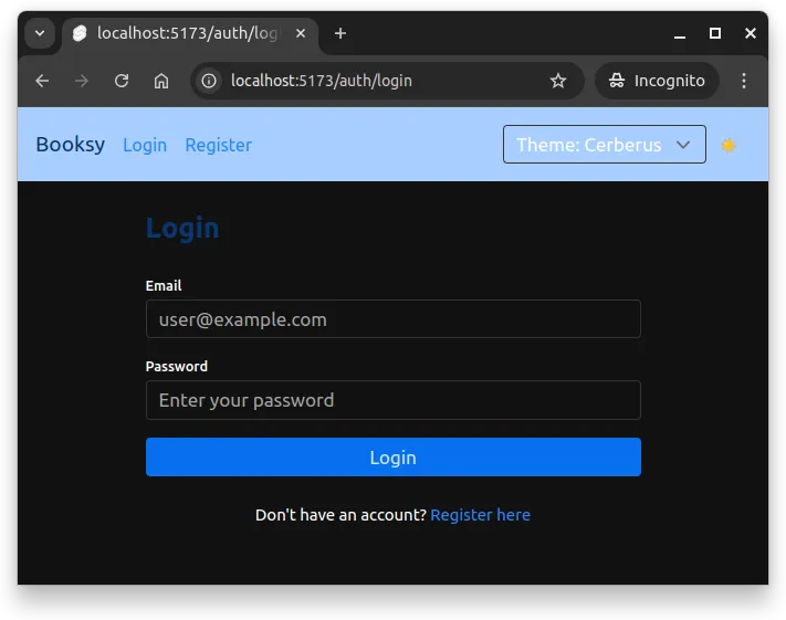
As you may notice from the figure above, there are elements that do not fully adapt to dark mode. Specifically; all custom elements that use Tailwind’s colors directly (e.g. bg-white, text-gray-800) do not adapt to dark mode automatically.
As an example, the text “Login” above the form has been declared as follows:
<h2 class="text-2xl font-bold text-primary-900 mb-6">
  {page.params.action === "login" ? "Login" : "Register"}
</h2>
This means that the text color is always text-primary-900. Tailwind’s utility classes provide two ways to define colors that adapt to dark mode. First, we can add another color to the class using the dark: prefix:
<h2 class="text-2xl font-bold text-primary-900 dark:text-primary-100 mb-6">
  {page.params.action === "login" ? "Login" : "Register"}
</h2>
And second, we can use Tailwind’s existing utility classes that provide both light and dark mode support. For example, if we wish to use text-primary-900 in light mode and text-primary-100 in dark mode, we use the utility class text-primary-900-100 — this class automatically applies the correct color (either 900 or 100) based on the current mode.
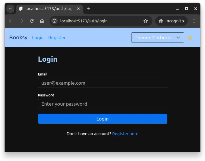
<h2 class="text-2xl font-bold text-primary-900-100 mb-6">
  {page.params.action === "login" ? "Login" : "Register"}
</h2>
Now, the text “Login” (or “Register”) adapts to dark mode, as shown in Figure 4 below.
The same styling would need to be applied to all custom elements, including e.g. the theme switcher, the header text, and any other custom components that use Tailwind’s utility classes (or custom colors).
Summary
In summary:
- Consistency creates cohesive user experiences and faster development. Design systems provide reusable components and guidelines that ensure styling decisions remain predictable across the application.
- CSS variables enable flexible theming by storing and reusing values. Declare variables with the
--prefix in:rootand access them withvar()to define colors, spacing, and typography that can change dynamically. - Design tokens provide semantic abstraction over raw CSS values. Instead of using specific colors like
#3b82f6directly, tokens like--color-primarycentralize design decisions and make updates easier. - Theme and mode switching can be achieved by changing attributes like
data-themeanddata-modeon thehtmlelement. Tailwind and Skeleton support theming and dark mode out of the box, allowing dynamic adjustments based on user preferences.