From Tables to Questions
Learning Objectives
- You can start a chart by naming the question it should answer.
- You can distinguish comparison, trend, distribution, and relationship questions.
- You can choose a reasonable first chart type for common study-log questions.
- You can explain why a chart that looks polished may still be the wrong chart.
The most common beginner mistake with charts is starting with the chart type:
I need to make a bar chart.Sometimes that is fine, but it skips the important step. A chart should start from a question:
Which subjects take the most total time?Now the bar chart has a purpose. It will compare subjects by total minutes.
The chart type should follow the question and the data. In this part, four question families are enough.
| Question family | Example study-log question | Useful chart |
|---|---|---|
| Comparison | Which subjects have the most total minutes? | Bar chart |
| Trend | How has study time changed over days? | Line chart |
| Distribution | Are sessions usually short or long? | Histogram |
| Relationship | Do longer sessions happen on certain subjects? | Scatter plot or grouped comparison |
This part mostly uses the first three. Relationship charts are useful, but they can quickly lead into statistics. It is enough here to know that relationship questions exist and that not every question is a bar chart question.
Start With One Question
Suppose this is your study-log DataFrame:
import pandas as pd
records = [    {"subject": "math", "minutes": 45, "date": "2026-05-10"},    {"subject": "history", "minutes": 30, "date": "2026-05-11"},    {"subject": "programming", "minutes": 60, "date": "2026-05-11"},    {"subject": "math", "minutes": 25, "date": "2026-05-12"},    {"subject": "programming", "minutes": 90, "date": "2026-05-13"},]
df = pd.DataFrame(records)df["date"] = pd.to_datetime(df["date"])
Here are three different questions you could ask:
Which subject has the most total minutes?How many minutes were logged each day?How long are sessions usually?They all use the same table, but they do not use the same summary.
For subject totals:
subject_totals = df.groupby("subject")["minutes"].sum()For daily totals:
daily_totals = df.groupby("date")["minutes"].sum()For session lengths:
lengths = df["minutes"]The first two are grouped summaries. The third uses one original column. That difference matters before plotting starts.
A Chart Is Not the First Draft of the Data
The summary helpers from Using Libraries are still useful. If you can print a small summary and predict whether it is right, the chart has a trustworthy source.
For example:
subject_totals = df.groupby("subject")["minutes"].sum()subject_totals = subject_totals.sort_values(ascending=False)print(subject_totals)Output:
subjectprogramming 150math 70history 30Name: minutes, dtype: int64Now the chart has a simple job: show programming, math, and history with bars whose heights are 150, 70, and 30. If the chart later looks strange, you can compare it to this printed summary.
Before the plotting code
0 / 5 points
The question is “Which subjects have the most total study time?” What should happen before any plotting code runs?
This is also why the question should be specific. “Visualize my study log” is too broad. It leaves too many decisions hidden. “Show total minutes by subject, from most to least” is specific enough to check.
Explain a good chart question
0 / 10 points
In a short paragraph, about 4-6 sentences, explain why “Which subjects have the most total study minutes?” is a better starting point for a chart than “Make a nice chart of my study log.” The sentence range is guidance, not a strict limit.
Mention the DataFrame columns relevant to this question, the summary needed before plotting, and one chart type that would fit the question.
Wrong Chart, Right Code
Code can run and still answer the wrong question.
Suppose the question is:
How has my total study time changed from day to day?A bar chart of subject totals may run correctly:
import matplotlib.pyplot as plt
subject_totals = df.groupby("subject")["minutes"].sum()
fig, ax = plt.subplots()ax.bar(subject_totals.index, subject_totals.values) 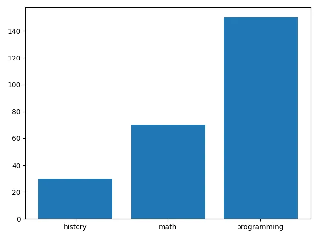
You will meet this plotting code properly in the next chapter. Here the only point is what it draws: one bar per subject. The code runs, but it does not answer the question. It compares subjects. The question asked about time.
The right preparation step points toward a time chart:
daily_totals = df.groupby("date")["minutes"].sum()daily_totals = daily_totals.sort_index()Only after that does a line chart make sense.
When you look at a proposed chart, ask:
- What question does this chart answer?
- Is that the question I meant to ask?
- What rows and columns did the code use?
- Was the data summarized before plotting, if the question needed a summary?
These questions will matter even more in the AI chapter, because AI assistants often produce visually plausible chart code for a slightly different question.
Check Your Understanding
- Why should a chart start from a question instead of a chart type?
- Which chart type fits a comparison question, a trend question, and a distribution question?
- What summary table does “How many minutes were logged each day?” need before plotting?
- How can plotting code run without errors and still produce the wrong chart?
AI Study Aid
Create a chapter diagram
We're looking into to what extent AI-generated diagrams could help with studying.
Use this study aid to generate an AI-generated visual summary of the material you just studied.
Each diagram style emphasizes the content in a different way, so you can choose the focus
that feels most useful.
Using the diagram generator is voluntary and does not affect your course progress. We encourage
you to try it out and see if it helps, but it's totally up to you! Your answers help us understand
how to make better study aids in the future.