Matplotlib Basics
Learning Objectives
- You can import matplotlib’s plotting interface as
plt. - You can create a figure and axes with
plt.subplots(). - You can make a small plot, label it, show it, and save it.
- You can write plotting helpers that return
(fig, ax).
Matplotlib is the basic plotting library used throughout much of the Python data ecosystem. The conventional import is:
import matplotlib.pyplot as pltYou will often see examples that call plt.plot(...) directly. That works, but in programs it is usually clearer to create a figure and an axes:
fig, ax = plt.subplots()The figure is the whole drawing area. The axes is the actual chart area with the x-axis, y-axis, labels, and plotted data. Most of your commands will go through ax.
Here is a tiny first plot:
import matplotlib.pyplot as plt
days = ["Mon", "Tue", "Wed"]visitors = [120, 185, 140]
fig, ax = plt.subplots()ax.plot(days, visitors)ax.set_title("Daily website visitors")ax.set_xlabel("Day")ax.set_ylabel("Visitors")
plt.show()
plt.show() opens the figure window when you run the script locally. In notebooks and some editors, the chart may appear inline instead. The important point is that show is a display step. It is not the same as preparing the data.
What changes with visualization
0 / 5 points
Data Visualization starts from the study-log DataFrame built in Using Libraries. What new work does visualization add?
This is the chart the program shows:
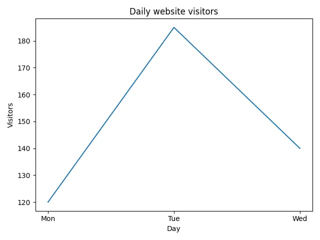
A tiny visitor line chart
0 / 5 points
Arrange the blocks to create a small labeled line chart of daily website visitors with matplotlib.
The setup and labels are grouped because their lines do not have a meaningful order within those stages. Put the setup first, draw the data next, then label and show the result.
Bar and Line in the Smallest Possible Form
A line chart connects values in order:
fig, ax = plt.subplots()ax.plot(["Mon", "Tue", "Wed"], [120, 185, 140])plt.show()This draws the same line shape as Fig 1, without the title and axis labels.
A bar chart compares separate categories:
fig, ax = plt.subplots()ax.bar(["Mon", "Tue", "Wed"], [120, 185, 140])plt.show()This draws the same three bars as Fig 2 below, but without the title and labels that give the reader context.
Both examples use lists. That is intentional. Before mixing pandas and plotting, it helps to see that matplotlib needs x values and y values.
Later chapters will prepare those values from a DataFrame:
subject_totals = df.groupby("subject")["minutes"].sum()subjects = subject_totals.indexminutes = subject_totals.valuesThen subjects and minutes play the same roles as the small lists above.
Figure and axes
0 / 5 points
After this line, what do fig and ax refer to?
fig, ax = plt.subplots()Titles and Labels
A chart without labels is hard to read after the moment of creation. Give the reader enough context:
fig, ax = plt.subplots()ax.bar(["Mon", "Tue", "Wed"], [120, 185, 140])ax.set_title("Daily website visitors")ax.set_xlabel("Day")ax.set_ylabel("Visitors")plt.show()The completed chart presents the days as separate categories:
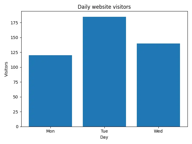
The title says what the chart is about. The x-axis label says what the categories are. The y-axis label says what the numbers mean.
Do not rely on memory. A chart file named plot.png viewed two days later should still be understandable.
Saving a Figure
Use fig.savefig(...) to save a chart:
fig.savefig("daily_visitors.png")The file extension tells matplotlib which format you want. .png is a useful default for charts.
If you are making many figures in one script, close figures you no longer need:
plt.close(fig)That releases the figure from matplotlib’s internal list of open figures. It is a small habit, but it prevents confusing behavior in longer scripts and tests.
Saving a figure
0 / 5 points
What does fig.savefig("daily_visitors.png") do?
Plotting Helpers
A useful plotting helper returns the figure and axes:
def plot_daily_visitors(days, visitors): fig, ax = plt.subplots() ax.plot(days, visitors) ax.set_title("Daily website visitors") ax.set_xlabel("Day") ax.set_ylabel("Visitors") return fig, axThen the caller decides what to do:
fig, ax = plot_daily_visitors(["Mon", "Tue", "Wed"], [120, 185, 140])fig.savefig("daily_visitors.png")plt.show()The helper creates the same line chart shown at the start of the chapter.
This keeps the plotting function testable. A test can call the helper and inspect the labels without opening a window.
Helpers and tests
0 / 5 points
A test wants to check a chart’s title without opening a window. Why does a helper that returns (fig, ax) make this easy?
The next exercise uses the same plotting pattern with temperature readings, different labels, and a different function name.
Temperature readings plotting helper
0 / 10 points
Define a function named plot_temperature_readings(times, temperatures).
times is a list of time labels, and temperatures is a list of temperature readings with the same length.
The function should:
- create a matplotlib figure and axes with
plt.subplots(), - plot
timeson the x-axis andtemperatureson the y-axis as a line chart, - set the title to
"Temperature during the day", - set the x-axis label to
"Time", - set the y-axis label to
"Degrees Celsius", - and return
(fig, ax).
Do not call input(...), do not print inside the function, and do not call plt.show() inside the function. The caller should decide whether to show or save the figure.
The next sequence applies the bar-chart pattern to café drink orders and then saves the figure into a file.
A Small Debugging Habit
If a chart is blank or strange, print the values before plotting:
print(days)print(visitors)If those lists are empty, the plotting code is not the real problem. The data preparation step produced no values. If the lists have different lengths, the x values and y values do not line up. If the values are in the wrong order, sort before plotting.
The old debugging habit still works. Inspect the data that enters the function.
Check Your Understanding
- What do
figandaxrefer to afterfig, ax = plt.subplots()? - Why is
plt.show()a display step rather than a data-preparation step? - Why should a plotting helper return
(fig, ax)instead of callingplt.show()itself? - If a chart comes out blank, what should you inspect first?
AI Study Aid
Create a chapter diagram
We're looking into to what extent AI-generated diagrams could help with studying.
Use this study aid to generate an AI-generated visual summary of the material you just studied.
Each diagram style emphasizes the content in a different way, so you can choose the focus
that feels most useful.
Using the diagram generator is voluntary and does not affect your course progress. We encourage
you to try it out and see if it helps, but it's totally up to you! Your answers help us understand
how to make better study aids in the future.