Seaborn as a Higher-Level Plotting Library
Learning Objectives
- You can describe seaborn as a plotting library built on matplotlib.
- You can import seaborn as
sns. - You can use simple seaborn calls for bar, line, and histogram charts.
- You can explain why seaborn still depends on clear data preparation.
Seaborn is a third-party plotting library built on top of matplotlib. The conventional import is:
import seaborn as snsThe examples and exercises in this chapter require Seaborn 0.12 or later. If the version check from the overview reports an older version, upgrade Seaborn in the same virtual environment:
python -m pip install --upgrade "seaborn>=0.12"Matplotlib gives you the basic plotting building blocks. Seaborn gives you convenient functions for common statistical charts. It works with table-shaped data and can calculate statistical summaries and uncertainty intervals for some plots. You do not need to learn any new statistics for this chapter.
Seaborn works especially well with pandas DataFrames. Instead of passing separate lists, you often pass a DataFrame and name the columns:
sns.barplot(data=summary, x="route", y="kilometres", errorbar=None, ax=ax)The column names are strings. That means they must match your real DataFrame columns.
A Bicycle-Ride DataFrame
This chapter uses a small log of bicycle rides, giving you a fresh context for the same prepare-then-plot pattern:
import pandas as pd
records = [    {"route": "Riverside", "kilometres": 8, "date": "2026-05-10"},    {"route": "Park loop", "kilometres": 5, "date": "2026-05-10"},    {"route": "Riverside", "kilometres": 12, "date": "2026-05-11"},    {"route": "Hill route", "kilometres": 7, "date": "2026-05-12"},    {"route": "Park loop", "kilometres": 9, "date": "2026-05-13"},    {"route": "Riverside", "kilometres": 6, "date": "2026-05-13"},]
df = pd.DataFrame(records)
A Seaborn Bar Chart
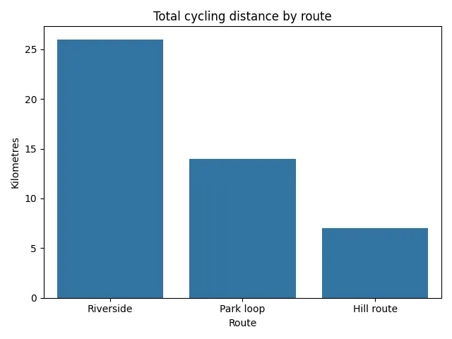
Prepare the route totals:
summary = ( df.groupby("route", as_index=False)["kilometres"] .sum() .sort_values("kilometres", ascending=False))Then plot them:
import matplotlib.pyplot as pltimport seaborn as sns
fig, ax = plt.subplots()sns.barplot(data=summary, x="route", y="kilometres", errorbar=None, ax=ax)ax.set_title("Total cycling distance by route")ax.set_xlabel("Route")ax.set_ylabel("Kilometres")plt.show()
The chart still uses matplotlib’s fig and ax. Seaborn draws onto the axes you provide. Because summary already contains exactly one total per route, errorbar=None turns off uncertainty intervals that would not add useful information here.
Seaborn team totals
0 / 10 points
Define a function named seaborn_team_totals(df).
df is a pandas DataFrame with columns team, points, and date.
The function should:
- prepare the total points for each team,
- put the teams in descending order by total points,
- create a matplotlib figure and axes,
- pass the prepared summary DataFrame to seaborn, drawing
teamon the x-axis andpointson the y-axis of those axes, - set the title to
"Total points by team", - set the x-axis label to
"Team", - set the y-axis label to
"Points", - and return
(fig, ax).
The input can contain several rows for the same team, so each bar must show a sum rather than an individual score or a mean. If you pass the already-aggregated table to sns.barplot, you may disable its uncertainty intervals with errorbar=None.
Example input:
df = pd.DataFrame([ {"team": "Red", "points": 12, "date": "2026-05-10"}, {"team": "Blue", "points": 9, "date": "2026-05-10"}, {"team": "Red", "points": 6, "date": "2026-05-11"}, {"team": "Green", "points": 14, "date": "2026-05-11"}, {"team": "Blue", "points": 16, "date": "2026-05-12"},])For this input, the bars should show Blue 25, Red 18, and Green 14, in that order.
For an empty DataFrame with those columns, return the labeled figure as usual; it simply has no bars.
Do not call input(...), do not print inside the function, and do not call plt.show() inside the function.
A Seaborn Line Chart
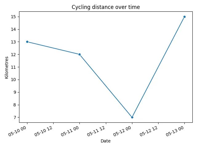
Prepare daily cycling distances:
daily = df.copy()daily["date"] = pd.to_datetime(daily["date"])daily = daily.groupby("date", as_index=False)["kilometres"].sum()daily = daily.sort_values("date")Then plot them:
fig, ax = plt.subplots()sns.lineplot(data=daily, x="date", y="kilometres", marker="o", ax=ax)ax.set_title("Cycling distance over time")ax.set_xlabel("Date")ax.set_ylabel("Kilometres")plt.show()The same rule applies: prepare the data first. Seaborn makes the plotting call shorter, but it does not decide what question you are asking.
A Seaborn Histogram
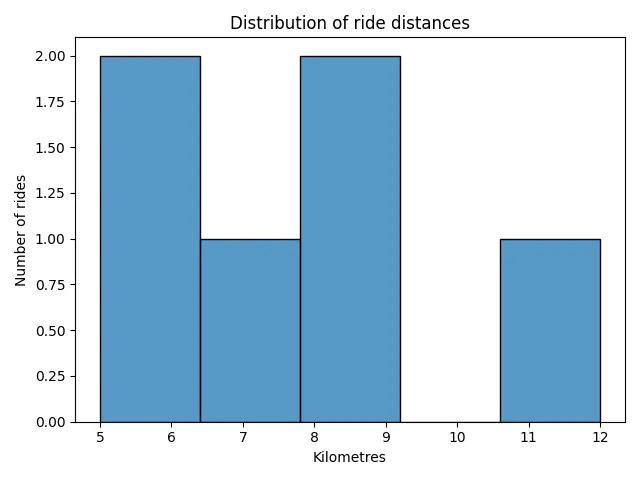
For the distribution of individual ride distances:
fig, ax = plt.subplots()sns.histplot(data=df, x="kilometres", bins=5, ax=ax)ax.set_title("Distribution of ride distances")ax.set_xlabel("Kilometres")ax.set_ylabel("Number of rides")plt.show()The DataFrame already has one row per ride, so no grouping is needed. The chart summarizes the kilometres column into ranges.
Seaborn route totals
0 / 5 points
Arrange the blocks to prepare total kilometres by bicycle route and draw a seaborn bar chart. Assume df already exists with columns route, kilometres, and date.
The independent imports and labels are grouped. Arrange the remaining stages according to their data dependencies.
What Seaborn Does Not Solve
Seaborn can make a chart look cleaner by default. It can also save you some matplotlib details. But it cannot know your project contract.
If your DataFrame columns are:
route, kilometres, datethen this code is wrong for your data:
sns.barplot(data=df, x="trail", y="distance")It may be a normal seaborn pattern for some other table. It is not correct for this bicycle-ride log.
Use the same library-checking habit from Using Libraries:
print(df.columns)print(df.head())Then write the seaborn call with the real columns.
Check Your Understanding
- How does seaborn relate to matplotlib?
- What does
sns.barplot(data=summary, x="route", y="kilometres", errorbar=None, ax=ax)expect to find insummary? - Why does seaborn not remove the need to prepare a summary first?
- How can you check that a seaborn example from documentation matches your DataFrame?
AI Study Aid
Create a chapter diagram
We're looking into to what extent AI-generated diagrams could help with studying.
Use this study aid to generate an AI-generated visual summary of the material you just studied.
Each diagram style emphasizes the content in a different way, so you can choose the focus
that feels most useful.
Using the diagram generator is voluntary and does not affect your course progress. We encourage
you to try it out and see if it helps, but it's totally up to you! Your answers help us understand
how to make better study aids in the future.