Making Charts Readable
Learning Objectives
- You can improve a chart with titles, labels, and readable tick text.
- You can choose figure sizes that fit the data.
- You can use color to clarify rather than decorate.
- You can identify clutter and misleading visual choices.
A chart is readable when the viewer can answer the intended question without guessing what the marks mean.
Readable does not mean fancy. It means clear.
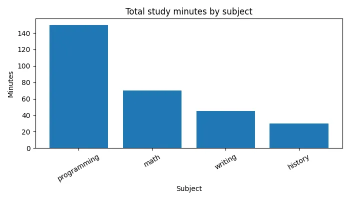
The snippets in this chapter polish the familiar subject-total bar chart:
import pandas as pdimport matplotlib.pyplot as plt
records = [    {"subject": "math", "minutes": 45, "date": "2026-05-10"},    {"subject": "history", "minutes": 30, "date": "2026-05-11"},    {"subject": "programming", "minutes": 60, "date": "2026-05-11"},    {"subject": "math", "minutes": 25, "date": "2026-05-12"},    {"subject": "programming", "minutes": 90, "date": "2026-05-13"},    {"subject": "writing", "minutes": 45, "date": "2026-05-14"},]
df = pd.DataFrame(records)subject_totals = df.groupby("subject")["minutes"].sum().sort_values(ascending=False)
The basics are:
fig, ax = plt.subplots(figsize=(7, 4))ax.bar(subject_totals.index, subject_totals.values)ax.set_title("Total study minutes by subject")ax.set_xlabel("Subject")ax.set_ylabel("Minutes")ax.tick_params(axis="x", rotation=30)fig.tight_layout()The figsize argument controls the figure size in inches. The fig.tight_layout() call asks matplotlib to adjust spacing so labels are less likely to be cut off.
Readability improvement
0 / 5 points
Which change most directly improves the readability of a subject-total bar chart?
Tick Labels
If category labels are long, rotate them:
ax.tick_params(axis="x", rotation=30)Use rotation carefully. A small rotation can help. A chart where every label is vertical can become hard to read. If labels are too long, consider whether shorter display names would be clearer.
Figure Size
A chart with three subjects does not need a huge figure. A chart with ten subjects may need more width.
fig, ax = plt.subplots(figsize=(8, 4))Figure size should serve the data. If the chart feels cramped, increase the size a little. If it feels empty, reduce it.
Color
Color can help, but it can also distract.
For a simple subject-total bar chart, one color is often enough:
ax.bar(subject_totals.index, subject_totals.values, color="steelblue")Using a different bright color for every bar may look lively, but it usually does not add meaning. Reserve color differences for actual differences in the data, such as highlighting one selected subject or separating two meaningful groups.
Also remember that not everyone sees color the same way. A chart should not depend only on red versus green to communicate an important difference. Labels, position, and shape matter too.
When color helps
0 / 5 points
When should bars in a study-log chart get different colors?
Legends
Use a legend when there is more than one plotted series and the reader needs to know which is which:
ax.legend()Do not add a legend when the labels are already obvious. A single blue line labeled by the title and axes usually does not need a legend that says “minutes”.
When a legend helps
0 / 5 points
When does a chart need a legend?
Avoiding Clutter
Clutter is anything that competes with the data without helping the reader understand it.
Common clutter:
- too many categories in one chart,
- labels that overlap,
- colors with no meaning,
- legends that repeat the title,
- titles that are vague,
- and chart types that add decoration without adding clarity.
Here is the same subject-total data with several of these problems at once — a vague title, no axis labels, colors that mean nothing, a redundant legend, unsorted bars, and tick labels squeezed until they are cut off:
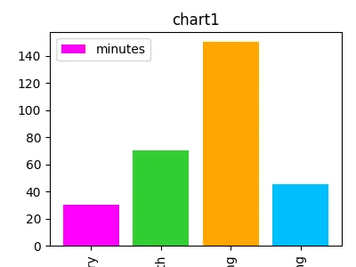
Every number in it is correct. Compare it with the chart at the top of this chapter, which shows the same data and answers the same question without making the reader work.
Write the comparison down while it is fresh: critique the cluttered chart in your own words.
Critique the cluttered chart
0 / 10 points
The Making Charts Readable chapter shows a cluttered version of the subject-totals bar chart: the title is chart1, the axes have no labels, every bar has a different bright color, a legend repeats the word minutes, the bars are unsorted, and the tick labels are squeezed until they are cut off. Every number in the chart is correct.
In a short paragraph, critique that chart. Describe at least two specific problems, explain how they make the chart harder to read, and suggest at least two useful fixes. One explanation may cover several related problems, and you do not need to propose a separate fix for every problem you happen to mention.
A useful chart checklist is:
- one clear question,
- one prepared summary,
- a title,
- labeled axes,
- readable tick labels,
- and no extra decoration.
That is enough. The point is not to impress the viewer. The point is to help the viewer read the data.
Now apply the checklist in a new context: the next exercise asks you to make a readable chart of workshop registrations.
A readable workshop chart
0 / 10 points
Define a function named readable_workshop_chart(df).
df is a pandas DataFrame with columns workshop, registrations, and date. Several rows may describe the same workshop.
The function should:
- prepare the total registrations for each workshop,
- put the workshops in descending order by total registrations,
- create a figure that is 7 inches wide and 4 inches high,
- draw a bar chart of the prepared totals,
- set the title to
"Total registrations by workshop", - set the x-axis label to
"Workshop", - set the y-axis label to
"Registrations", - rotate the x-axis tick labels by 30 degrees,
- apply tight layout so the labels are not cut off,
- and return
(fig, ax).
Example input:
df = pd.DataFrame([ {"workshop": "Python Basics", "registrations": 18, "date": "2026-06-01"}, {"workshop": "Data Stories", "registrations": 25, "date": "2026-06-01"}, {"workshop": "Python Basics", "registrations": 12, "date": "2026-06-02"}, {"workshop": "Web Design", "registrations": 10, "date": "2026-06-02"}, {"workshop": "Web Design", "registrations": 8, "date": "2026-06-03"},])For this input, the bars should show Python Basics 30, Data Stories 25, and Web Design 18, in that order.
For an empty DataFrame with those columns, return the labeled figure as usual; it simply has no bars.
Do not call input(...), do not print inside the function, and do not call plt.show() inside the function.
Check Your Understanding
- Which three text elements help readers understand most charts?
- When does rotating tick labels help, and when does it start to hurt?
- When should bars get different colors?
- What is clutter, and why does it matter?
AI Study Aid
Create a chapter diagram
We're looking into to what extent AI-generated diagrams could help with studying.
Use this study aid to generate an AI-generated visual summary of the material you just studied.
Each diagram style emphasizes the content in a different way, so you can choose the focus
that feels most useful.
Using the diagram generator is voluntary and does not affect your course progress. We encourage
you to try it out and see if it helps, but it's totally up to you! Your answers help us understand
how to make better study aids in the future.