Bar Charts for Categories
Learning Objectives
- You can use a bar chart for category comparisons.
- You can prepare subject totals with pandas before plotting.
- You can sort category summaries to make comparisons easier.
- You can avoid misleading category comparisons.
A bar chart is useful when you want to compare separate categories. In the study log, subject is a category:
math, history, programming, writingThe question:
Which subjects have the most total study time?is a category comparison. This chapter uses a small sample log:
import pandas as pd
records = [    {"subject": "math", "minutes": 45, "date": "2026-05-10"},    {"subject": "history", "minutes": 30, "date": "2026-05-11"},    {"subject": "programming", "minutes": 60, "date": "2026-05-11"},    {"subject": "math", "minutes": 25, "date": "2026-05-12"},    {"subject": "programming", "minutes": 90, "date": "2026-05-13"},    {"subject": "writing", "minutes": 45, "date": "2026-05-14"},]
df = pd.DataFrame(records)
First, summarize the DataFrame:
subject_totals = df.groupby("subject")["minutes"].sum()subject_totals = subject_totals.sort_values(ascending=False)print(subject_totals)Then plot the summary:
import matplotlib.pyplot as plt
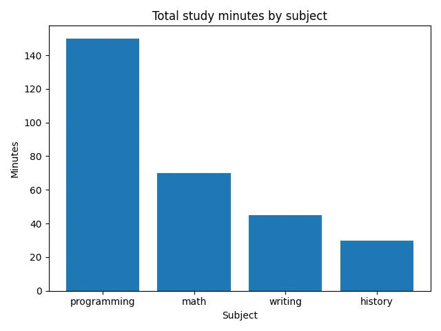
fig, ax = plt.subplots()ax.bar(subject_totals.index, subject_totals.values)ax.set_title("Total study minutes by subject")ax.set_xlabel("Subject")ax.set_ylabel("Minutes")plt.show()
The chart is not plotting every session. It is plotting one summary value per subject:
Bar chart purpose
0 / 5 points
When is a bar chart a good fit for the study-log data?
From Summary Rows to Bars
It is worth tracing the connection once by hand. The sorted summary prints as:
subjectprogramming 150math 70writing 45history 30Name: minutes, dtype: int64The chart draws exactly these rows, in this order:
- the first row,
programming 150, becomes the first bar, 150 units tall, - the second row,
math 70, becomes the second bar, - the third row,
writing 45, becomes the third bar, - and the last row,
history 30, becomes the shortest bar.
Nothing else enters the chart. If a bar looks wrong, the summary row behind it is wrong, and the place to look is the groupby step, not the plotting call. This is the same layer-by-layer debugging you used with pandas summaries in Using Libraries.
Why Sorting Helps
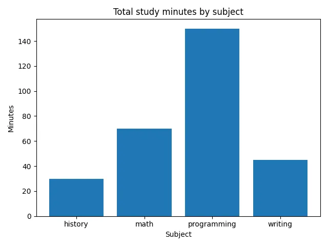
Compare these two printed summaries:
subjecthistory 30math 70programming 150writing 45Name: minutes, dtype: int64and:
subjectprogramming 150math 70writing 45history 30Name: minutes, dtype: int64The second one is easier to scan because the biggest value is first. Sorting helps the chart for the same reason.
subject_totals = subject_totals.sort_values(ascending=False)Do this before plotting. The bar order comes from the order of subject_totals.index.
Here is the same chart without sorting. Every number is identical, but the reader has to work harder to compare the subjects:
Sorted subject-total bars
0 / 5 points
Arrange the blocks to draw a bar chart of subject totals, sorted from largest to smallest. Assume df already exists with columns subject, minutes, and date.
The import, drawing calls, and labels are grouped into meaningful stages. Arrange the stages according to their data dependencies.
A Helper for Plotting Data
It is often useful to prepare a small DataFrame for the chart:
summary = ( df.groupby("subject", as_index=False)["minutes"] .sum() .sort_values("minutes", ascending=False))This produces a table with two columns:
subject minutes2 programming 1501 math 703 writing 450 history 30The as_index=False part keeps subject as an ordinary column instead of making it the Series index. That can be convenient when using seaborn later, because seaborn usually names columns directly.
Keeping subject as a column
0 / 5 points
What does as_index=False change in this summary?
summary = df.groupby("subject", as_index=False)["minutes"].sum()Now apply the same preparation steps to library-loan data. The column names and subject matter change, but the grouped-and-sorted result still has one row per category.
Genre totals for plotting
0 / 10 points
Define a function named genre_totals_for_plot(df).
df is a pandas DataFrame with columns genre, loans, and date. Each row records how many books from one genre were loaned on a date.
The function should:
- group rows by
genrewithgroupby, - sum
loansfor each genre, - return a DataFrame with exactly two columns:
genreandloans, - sort the rows with
sort_valuesfrom largest total loans to smallest total loans, - and work for an empty DataFrame with those columns.
Example input:
df = pd.DataFrame([ {"genre": "mystery", "loans": 12, "date": "2026-05-10"}, {"genre": "history", "loans": 8, "date": "2026-05-11"}, {"genre": "mystery", "loans": 7, "date": "2026-05-12"},])Example result:
genre loans0 mystery 191 history 8The exact index values do not matter, but the row order and column names do. Do not read or write files, ask for user input, or print inside the function.
Common Mistake: Plotting Raw Rows
It is tempting to skip the summary and plot the DataFrame directly:
These are the six rows that would be passed to the plotting call:
subject minutesmath 45history 30programming 60math 25programming 90writing 45fig, ax = plt.subplots()ax.bar(df["subject"], df["minutes"])ax.set_title("Raw study-session rows")ax.set_xlabel("Subject")ax.set_ylabel("Minutes")plt.show()Here is what those raw rows produce. Repeated subjects occupy the same x position, so some bars cover others:
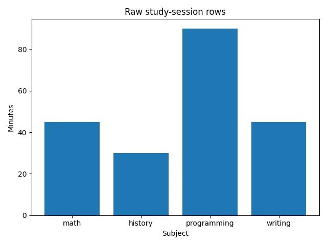
This runs without an error, but matplotlib draws six rectangles at only four subject positions. Rows that share a subject overlap. Matplotlib does not aggregate the rows or calculate a maximum. Because these same-color rectangles overlap, the visible outline reaches the tallest individual rectangle at each subject position. Here, math appears to be 45 minutes instead of its 70-minute total, and programming appears to be 90 minutes instead of its 150-minute total. The result looks like a subject comparison while not answering the question “which subject has the most minutes?”
If the question is about totals, group first, then plot the summary. When a bar chart surprises you, check what one bar actually represents before adjusting any plotting code.
Plotting raw rows
0 / 5 points
A DataFrame has several session rows per subject. What does this actually draw?
ax.bar(df["subject"], df["minutes"])What Bar Charts Are Not For
A bar chart is not always the best first choice.
If the question is about time order:
How did study minutes change over the week?a line chart is usually clearer than a bar chart of subjects.
If the question is about individual session lengths:
Are sessions usually short or long?a histogram is usually clearer than a bar chart with one bar per session.
If the categories are not comparable, a bar chart can mislead. For example, comparing total minutes for “math” and “all science subjects” would mix one subject with a whole group. The bars would look comparable, but the categories would not mean the same kind of thing.
Before making a bar chart, check:
- Is each bar a comparable category?
- Does each bar measure the same value, such as total minutes?
- Would sorting make the comparison easier?
- Are the labels clear enough that the reader knows what is being compared?
If yes, a bar chart is a good tool.
Check Your Understanding
- Does a subject-total bar chart plot raw sessions or a grouped summary?
- Why does sorting the totals before plotting help the reader?
- What does
as_index=Falsechange about the grouped result? - Name a study-log question where a bar chart is the wrong first choice.
AI Study Aid
Create a chapter diagram
We're looking into to what extent AI-generated diagrams could help with studying.
Use this study aid to generate an AI-generated visual summary of the material you just studied.
Each diagram style emphasizes the content in a different way, so you can choose the focus
that feels most useful.
Using the diagram generator is voluntary and does not affect your course progress. We encourage
you to try it out and see if it helps, but it's totally up to you! Your answers help us understand
how to make better study aids in the future.