Critiquing AI-Suggested Visualizations
Learning Objectives
- You can check whether an AI-suggested chart matches the question.
- You can check whether AI-generated plotting code uses the real DataFrame columns.
- You can identify misleading or unsupported chart choices.
- You can write a precise visualization prompt that keeps you in control.
This chapter develops the next AI-collaboration skill: critiquing AI-suggested visualizations. The previous skill was working with libraries you are still learning.
The risk is slightly different now. With pandas, the AI might invent a method name or use the wrong column. With charts, the code might be valid and the image might look polished, while the chart still answers the wrong question or suggests a misleading conclusion.
Your job is to critique the chart idea, not only the syntax.
Four Checks
When an AI assistant suggests a chart, check four things.
First, does the chart match the question?
If the question is “How has study time changed over days?”, a subject-total bar chart does not answer it.
Second, does the code use the real columns?
Your study-log DataFrame has:
subject, minutes, dateCode that uses "topic", "duration", or "day" is written for a different table unless you adapt it.
Third, did the code prepare the right summary?
For total minutes by subject, the code should group by subject and sum minutes:
summary = df.groupby("subject", as_index=False)["minutes"].sum()Plotting raw session rows may answer a different question.
Fourth, can you explain the result honestly?
A chart can show that one subject has more logged minutes than another. It cannot prove that one subject is more important, harder, or better. Those are interpretations beyond the chart.
What a chart can show
0 / 5 points
Which statement best matches the role of visualizations in this part?
Critique an AI-suggested chart
0 / 10 points
An AI assistant is asked:
How has my study time changed over days?It suggests:
sns.barplot(data=df, x="subject", y="minutes")Your study-log DataFrame has columns subject, minutes, and date.
In a short paragraph, about 4-6 sentences, critique the suggestion. Explain what is useful or plausible about it, what does not match the question, and what summary/chart would better answer the question. Explicitly describe preparing one total per date and putting those dates in chronological order. The sentence range is guidance, not a strict limit.
A Worked Critique
Suppose you ask:
How has my study time changed over days?Use this complete six-row sample so the suggestion and the resulting image can be checked against the same data:
import pandas as pd
records = [    {"subject": "math", "minutes": 45, "date": "2026-05-10"},    {"subject": "history", "minutes": 30, "date": "2026-05-11"},    {"subject": "programming", "minutes": 60, "date": "2026-05-11"},    {"subject": "math", "minutes": 25, "date": "2026-05-12"},    {"subject": "programming", "minutes": 90, "date": "2026-05-13"},    {"subject": "history", "minutes": 50, "date": "2026-05-13"},]
df = pd.DataFrame(records, columns=["subject", "minutes", "date"])
An assistant suggests:
import seaborn as sns
sns.barplot(data=df, x="subject", y="minutes")
This code may run. It uses real columns. But it does not answer the question. It compares subjects, not days.
Here is what the suggestion actually draws for a small sample log:
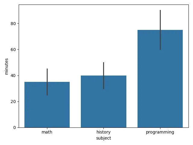
There is another issue, and the picture shows it. sns.barplot groups the raw rows by the category on the x-axis. By default, each bar is the mean of the minutes values for that subject, and seaborn adds uncertainty intervals. Those bars are not subject totals and they do not show change over time. For a beginner project, it is clearer to prepare the daily total yourself:
daily = df.copy()daily["date"] = pd.to_datetime(daily["date"])daily = daily.groupby("date", as_index=False)["minutes"].sum()daily = daily.sort_values("date")Then plot and label the corrected chart:
import matplotlib.pyplot as plt
fig, ax = plt.subplots()sns.lineplot(data=daily, x="date", y="minutes", marker="o", ax=ax)ax.set_title("Study minutes over time")ax.set_xlabel("Date")ax.set_ylabel("Minutes")plt.show()
Now the chart matches the question: one total per day, in date order.
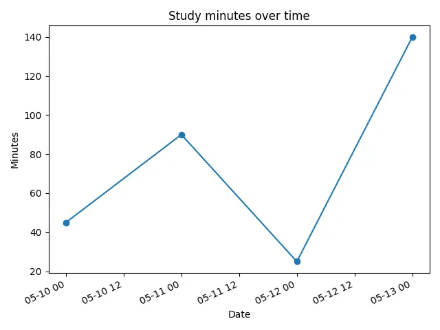
Rebuild that fix yourself: arrange the preparation and plotting lines that answer the daily-minutes question.
The right chart for the question
0 / 5 points
The question is: “How many total study minutes were logged on each date?” Arrange the blocks to prepare the daily totals and draw a chart that answers it. Assume df already exists with columns subject, minutes, and date.
The imports and related preparation lines are grouped. Arrange the remaining stages according to their data dependencies.
Better Prompts for Chart Help
A vague prompt:
Make a cool chart for my study log.This invites the assistant to guess the question, the data shape, and the chart type.
A better prompt:
I have a pandas DataFrame named df with columns subject,minutes, and date. The date column can be converted withpd.to_datetime. I want one chart that answers this question:how many total study minutes were logged on each date?Please prepare the daily totals first, sort by date, thenmake a simple line chart with matplotlib or seaborn. Usereadable intermediate variables and return fig, ax insteadof calling plt.show().This prompt gives the assistant less room to drift:
- it names the DataFrame columns,
- it names the question,
- it names the summary step,
- it asks for date sorting,
- and it preserves the project boundary by returning
fig, ax.
Prompt a daily study chart
0 / 10 points
Write a prompt that asks a large language model to create Python code only.
The generated code must define a function named make_daily_minutes_chart(df) with this exact behavior:
dfis a pandas DataFrame with columnssubject,minutes, anddate,- leave the input DataFrame unchanged (working on a copy is one way),
- convert the
datecolumn withpd.to_datetime, - group rows by date and sum
minutes, - put the daily totals in chronological order,
- create a simple line chart of daily minutes,
- set the title to
"Study minutes over time", - set the x-axis label to
"Date"and the y-axis label to"Minutes", - return
(fig, ax), - do not call
input(...), - do not print anything,
- and do not call
plt.show()inside the function.
Ask for readable intermediate variables rather than one dense method chain. Ask for Python code only.
Where You Are in the Arc
The course’s AI-collaboration arc now includes:
| Course section | AI skill | What it gives you |
|---|---|---|
| Getting Started with Programming | Reading code you didn’t write | Knowing what a piece of code does |
| Making Decisions and Repeating Work | Verifying behavior and finding edge cases | Knowing whether what it does is right |
| Organizing Code with Functions | Specifying what you want | Knowing what to ask for in the first place |
| Reading and Writing Files | Detecting plausible-but-wrong code | Knowing when “it runs” is not “it works” |
| Summarizing Your Data | Comparing approaches | Knowing how to choose between several right answers |
| Structuring Your Data | Critiquing data designs | Knowing whether the data is in the right shape |
| Using Libraries | Working with AI on libraries you’re learning | Knowing how to verify unfamiliar library code |
| Data Visualization | Critiquing AI-suggested visualizations | Knowing whether a chart serves the data and question |
| Games and Programming in the Wild | Iterating with AI on a real project | Knowing how to use AI without losing control of the finished work |
The next chapter applies the skill directly. You will add charts to the study log, but you will keep the same boundaries you have built over the course: load data, create the DataFrame, prepare summaries, plot, and check the result.
Check Your Understanding
- What four checks should an AI-suggested chart pass?
- Why can chart code be valid and the image polished while the chart is still the wrong chart?
- The question is about change over days, but the suggestion is
sns.barplot(data=df, x="subject", y="minutes"). What is wrong, and what should the code do instead? - What should a good visualization prompt include?
AI Study Aid
Create a chapter diagram
We're looking into to what extent AI-generated diagrams could help with studying.
Use this study aid to generate an AI-generated visual summary of the material you just studied.
Each diagram style emphasizes the content in a different way, so you can choose the focus
that feels most useful.
Using the diagram generator is voluntary and does not affect your course progress. We encourage
you to try it out and see if it helps, but it's totally up to you! Your answers help us understand
how to make better study aids in the future.