Line Charts for Time
Learning Objectives
- You can use a line chart for values that have a meaningful order.
- You can convert the
datecolumn withpd.to_datetime. - You can group study sessions by date and sort them before plotting.
- You can describe missing days carefully.
A line chart is useful when the x-axis has a meaningful order. Dates have a meaningful order, so line charts are a natural way to show study time over days.
Start with a small study-log DataFrame. Its rows are deliberately out of order, and two rows share a date:
import pandas as pd
records = [    {"subject": "math", "minutes": 25, "date": "2026-05-12"},    {"subject": "math", "minutes": 45, "date": "2026-05-10"},    {"subject": "history", "minutes": 30, "date": "2026-05-11"},    {"subject": "programming", "minutes": 60, "date": "2026-05-11"},]
df = pd.DataFrame(records, columns=["subject", "minutes", "date"])
One Reliable Preparation Routine
Date conversion changes a column. A helper should not unexpectedly change the DataFrame that its caller passed in, so make a working copy first:
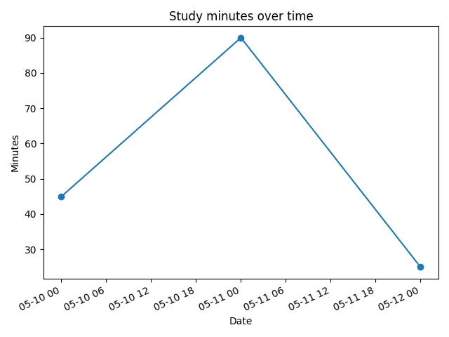
working = df.copy()working["date"] = pd.to_datetime(working["date"])daily = working.groupby("date", as_index=False)["minutes"].sum()daily = daily.sort_values("date")print(daily)Output:
date minutes0 2026-05-10 451 2026-05-11 902 2026-05-12 25df.copy() is one clear way to preserve the input. The important contract is the observable result: the caller’s DataFrame should still have the same rows, values, and dtypes after the helper returns.
Each line in the routine has a separate job:
pd.to_datetimegives the date column real date values.groupby(...).sum()combines sessions logged on the same date.- chronological sorting determines the order in which the chart connects the points.
Now plot the daily totals:
import matplotlib.pyplot as plt
fig, ax = plt.subplots()ax.plot(daily["date"], daily["minutes"], marker="o")ax.set_title("Study minutes over time")ax.set_xlabel("Date")ax.set_ylabel("Minutes")plt.show()
The marker="o" argument draws a point at each actual data value. This can make small charts easier to read.
Date Conversion Matters
Using Libraries already introduced this line:
df["date"] = pd.to_datetime(df["date"])Use it before date-based plotting. It turns date strings into pandas date values. That makes sorting and formatting more reliable.
If you forget the conversion, some simple ISO date strings may still sort correctly as text. That can make the bug hard to notice. Do not rely on that accident. A date column should be a date column before date work.
Common Mistake: String Dates on the X-Axis
If the date column is still text, matplotlib treats each date string as a plain category. The points are then placed in row order, not in time order:
fig, ax = plt.subplots()ax.plot(df["date"], df["minutes"], marker="o") # dates still stringsax.set_title("String dates in row order")ax.set_xlabel("Date")ax.set_ylabel("Minutes")plt.show()The resulting line follows the row order and jumps backward and forward between the date labels:
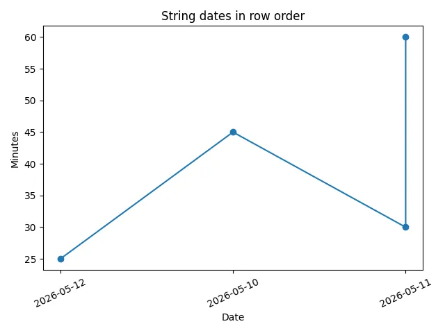
With unsorted rows, the line jumps back and forth, because “2026-05-12” is just a label to matplotlib, not a moment in time. Even when the rows happen to be sorted, the x-axis is category-shaped: every date gets the same spacing regardless of gaps between days.
The fix is the routine above: convert with pd.to_datetime first, then group and order the result. Real date values give the axis a real timeline.
Sorting Matters
Line charts connect points in the order you give them. If the rows are out of order, the line will jump backward and forward in time.
The preparation routine already handles this: grouping combines multiple sessions on the same day, and ordering puts the days on a real timeline. Only then should you plot.
Now arrange that complete routine yourself. The blocks combine independent setup and labeling lines, so the remaining order follows the data dependencies.
Daily totals line chart
0 / 5 points
Arrange the blocks to prepare daily totals from a study-log DataFrame and plot them in date order. Assume df already exists with columns subject, minutes, and date.
The imports, preparation lines, and labels are grouped into meaningful stages. Arrange the stages according to their data dependencies.
Converting dates
0 / 5 points
Why convert the date column with pd.to_datetime before plotting over time?
Row order and lines
0 / 5 points
The rows of daily are in the order May 12, May 10, May 11. What does this draw?
ax.plot(daily["date"], daily["minutes"])Missing Days
Suppose the study log has sessions on May 10, May 11, and May 13, but not May 12. The grouped summary will have no row for May 12:
date minutes0 2026-05-10 451 2026-05-11 902 2026-05-13 30The chart connects the available totals from May 11 to May 13:
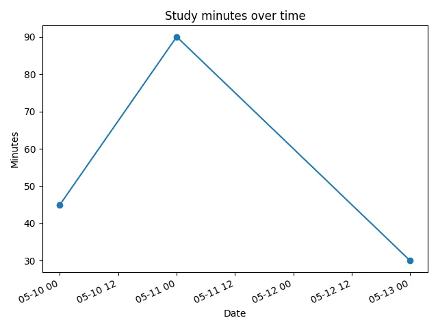
A missing row is not automatically the same as a measured zero. The user may have done no studying, forgotten to log a session, or supplied an incomplete file. You do not need to fill the gap here; inspect the daily summary and describe only what the available rows show.
Missing days
0 / 5 points
The grouped daily summary has rows for May 10, May 11, and May 13, but no row for May 12. What does that tell you?
Now practice the full routine: a reusable line-chart helper first, then a daily chart helper that receives the first helper as starter code.
Draw the reusable chart with the axes’ plot method and mark each value. Work out the complete call from the function parameters rather than copying one from this paragraph.
When a Line Chart Is Wrong
A line chart implies order and connection. That is why it fits dates. It is usually not the right chart for subject names:
fig, ax = plt.subplots()ax.plot( ["history", "math", "programming"], [30, 70, 150], marker="o",)ax.set_title("An arbitrary line between subjects")ax.set_xlabel("Subject")ax.set_ylabel("Minutes")plt.show()The connected line suggests a relationship between neighboring subjects even though their order is arbitrary:
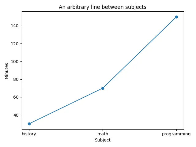
This draws a line from history to math to programming, but that order is arbitrary. There is no natural path from one subject to the next. A bar chart is clearer for separate categories.
Use a line when the x-axis values have an order that matters.
Check Your Understanding
- Why do line charts fit dates but not subject names on the x-axis?
- Why should the
datecolumn be converted withpd.to_datetimebefore date-based plotting? - What goes wrong if the daily totals are not sorted before plotting?
- Why is a missing day not automatically the same as a zero-minute day?
AI Study Aid
Create a chapter diagram
We're looking into to what extent AI-generated diagrams could help with studying.
Use this study aid to generate an AI-generated visual summary of the material you just studied.
Each diagram style emphasizes the content in a different way, so you can choose the focus
that feels most useful.
Using the diagram generator is voluntary and does not affect your course progress. We encourage
you to try it out and see if it helps, but it's totally up to you! Your answers help us understand
how to make better study aids in the future.